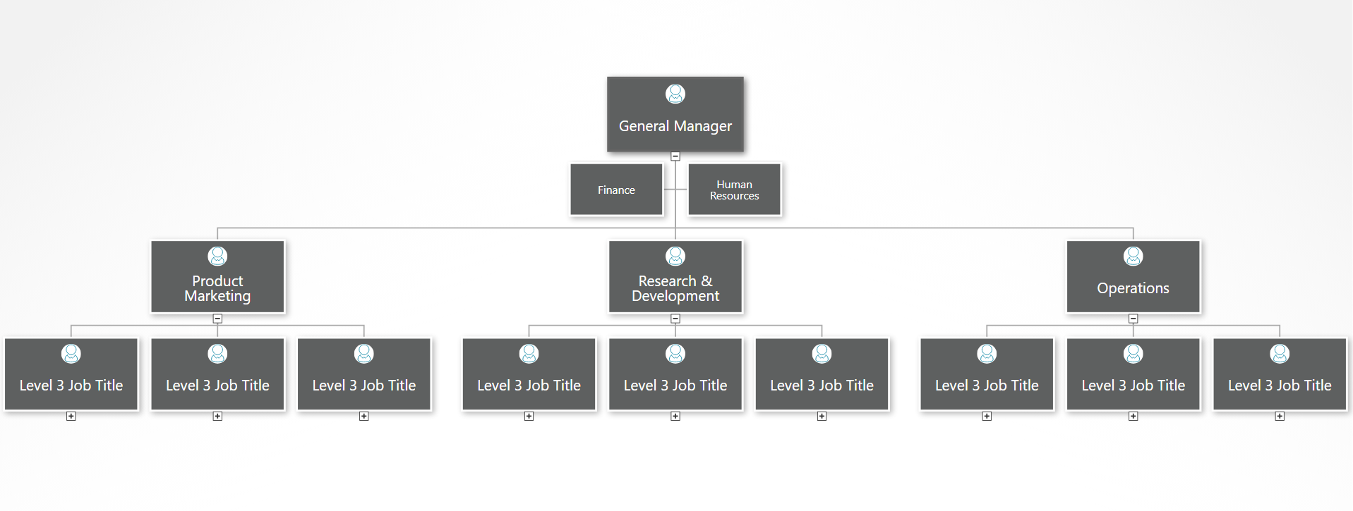
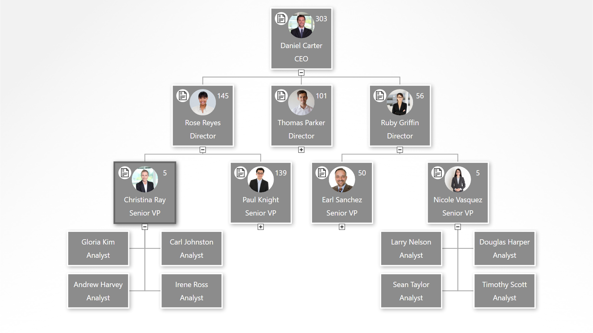
An organizational chart helps teams of people understand how they work together. When you look at an org chart, it should be obvious who reports to whom. If you can’t tell when looking at an org chart, perhaps it is another type of diagram.
- Organizational charts are hierarchical. Every reporting relationship is clear.
- Diagrams are not always hierarchical. They can convey many other ideas besides a reporting relationship.
Organizational charts have been used for decades to quickly convey information about a hierarchical structure. Just a few years ago, it would take hours to painstakingly create an org chart in PowerPoint, Visio, or some other drawing software. Recently, modern org chart software tools can create large organizational charts in minutes.
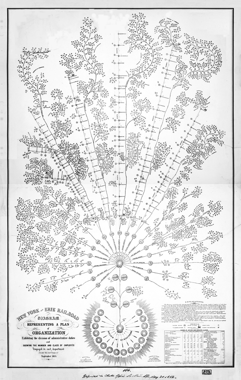
The first organizational chart is epic. It takes up a giant piece of paper and was hand-drawn by George Holt Henshaw.
Look at it. It makes one wonder at the beauty of an org chart made with such artistic grace. Why don’t modern org charts look like this?
Well, the answers are fairly obvious:
- Expense: Can you imagine hiring an artist to draw something similar for your organization?
- Usability: Sure, it looks nice on the board room wall, but thousands of workers don’t have access to it
- Relevance: It was already out-of-date as soon as it was finished
Let’s use this first org chart as inspiration for what’s important for a modern org chart:
- Beautiful: People should want to look at your org chart. If the design is ugly, it’s hard to focus on the information it conveys
- Detailed: While it’s cool to view all levels of an organization at once, it’s also important to be able to zoom in and see relevant details like headcount or contact info.
- Branded: The first organizational chart clearly says “New York and Eerie Railroad” in the corner. Your org chart might not end up in the Library of Congress, but it’s important that people immediately see your brand when they look at your org chart.
Knowing how you’re going to use your organizational chart is a critical first step in creating an org chart.
Here are some common uses of org charts:
- Make an employee directory with contact information to improve communication
- Report your org structure to shareholders, government agencies, or potential clients to prove compliance with rules and best practices
- Explain tasks to new hires
- Inspire employees to plan their own personal career path
- Plan for upcoming workforce changes
- Empower managers to make better decisions about allocating people to projects
First, decide if you want to draw your org chart or automatically create your org chart from data.
Drawing an org chart by hand makes sense in these types of circumstances:
- Small organizations (less than 20 people)
- Updating the org chart is not required
- No data about people and their bosses is available in a spreadsheet
It’s weird that people often draw org charts considering the drawbacks. Is it because people are in such a hurry to get started that they use whatever drawing software they already have? Or could it be that people fail to grasp how large a project creating an org chart can be?
Automatically creating an org chart from data is the better choice for most people. The main hurdle to overcome is to accept that you’ll need to spend 15-30 minutes learning a new organizational chart software tool. That’s 15-30 minutes you could have spent drawing an org chart, but it’ll save you countless hours when it comes to updating, editing, designing, and sharing automatic org charts.
There are many different types of organizational structures, but the two main examples are Functional and Divisional. Here are two simple examples of these types of organizational chart.
Divisional Organization Chart
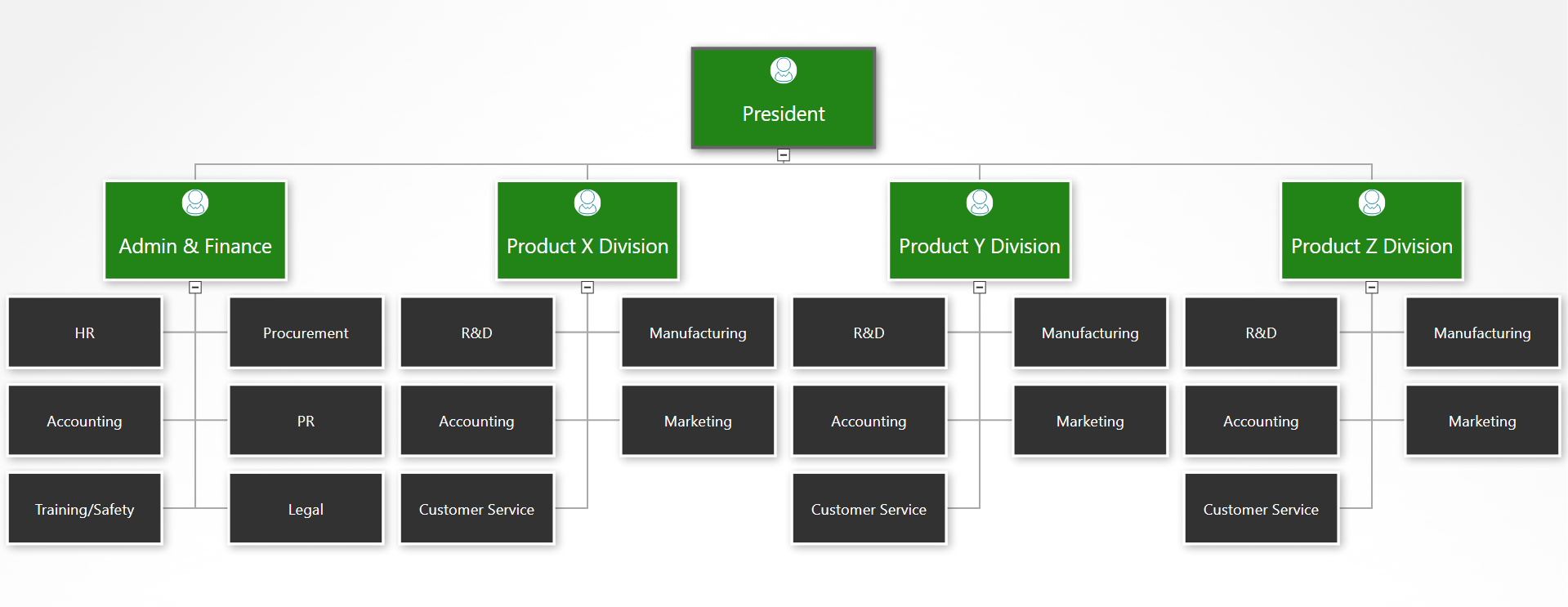
Functional Organization Chart
