How to Embed an Org Chart Online

Org charts usually get shared as a PDF, which is static and a little boring. But what if you could embed an online org chart on your website or intranet? It would bring your org charts to life in a way that was previously not possible.Embed org chart online instead of printing PDF

Here’s how to get started with embedding an org chart:

  1. Log in to your preferred org chart software. In this case, we’re using OrgWeaver and Organimi as examples.
  2. Share a public version of your org chart. You’ll need a URL that looks something like this: https://app.orgweaver.com/pub/XPKKSJ
  3. Create an embed code using an iFrame that will look something like this: “<iframe src=”https://app.orgweaver.com/pub/XPKKSJ” height=”600px” width=”800px”></iframe>”
  4. Paste the iFrame code within the <body> tag on your website. If you don’t know how to do that, then reach out to whoever runs your intranet or website (they’ll know what to do)

Troubleshooting iFrame org chart embeds

  • Some online org charts won’t allow you to use an iFrame. To check on your own, enter the URL of the org chart software you’re trying to use at this iFrame checker. If there are errors, then you’ll have to contact your org chart software vendor.
  • There are many different iFrame settings that are available. Try using an iFrame generator to explore different options to make your org chart look great in an iFrame.
  • Make sure that both your website, and the online org chart are using HTTPS instead of HTTP

Embedded org chart example

Try to do the following with this embedded org chart from OrgWeaver:

  • Expand/collapse org chart levels
  • Use your mouse to move the org chart
  • Zoom in and out

Example: Org Chart Levels for Designers

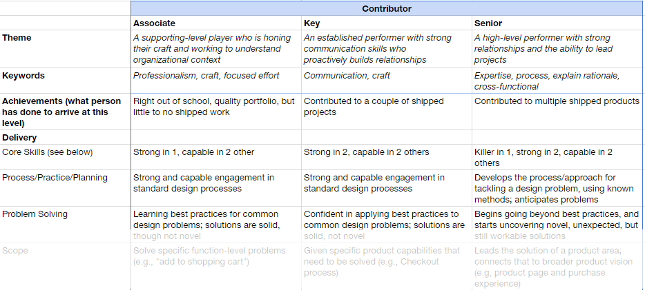
Peter Merholz literally wrote the book on “Org Design for Design Orgs.” Org design isn’t easy, which is why it’s very helpful to look to experts like Peter before diving into it. In his blog post entitled “Have better career conversations with your design team with this levels framework“, Peter actually shares detailed job descriptions for each level of his design org.

org design level example

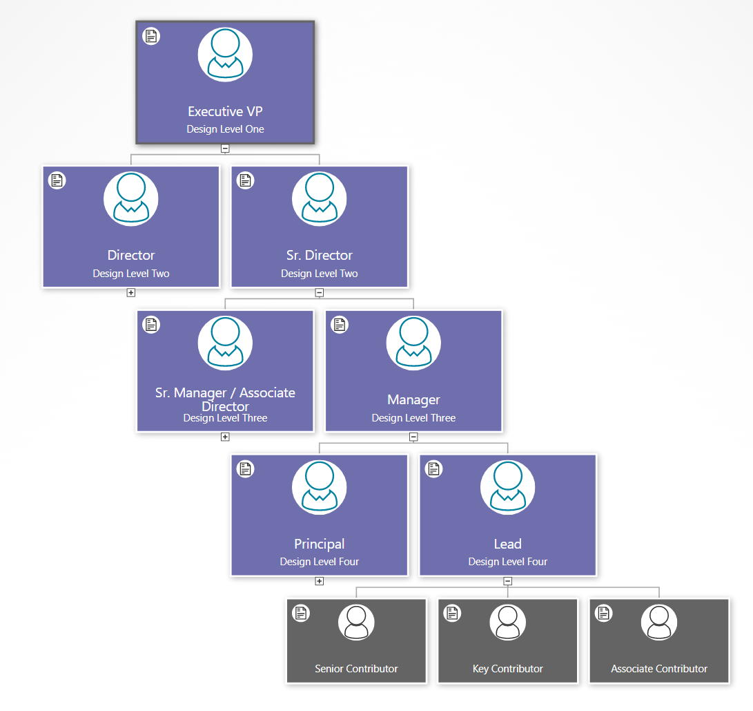
The design team role descriptions include:

  • Executive VP
  • Sr. Director
  • Director
  • Sr. Manager / Associate Director
  • Manager
  • Principal
  • Lead
  • Sr. Contributor
  • Key Contributor
  • Associate Contributor

For each role description, Peter outlines these key aspects:

  • Themes
  • Keywords
  • Achievements
  • Delivery
  • Core skills
  • Process/Practice/Planning
  • Problem Solving
  • Scope
  • Communication
  • Presentation
  • Cross-functional Meetings
  • Leadership
  • Relationship with team
  • People Management
  • Recruiting / Hiring

While this is a specific case for one area of a business, the spreadsheet that Peter shares is fascinating for anyone struggling with ways to clearly define roles and organize them into levels.

We often get requests at OrgWeaver to help with visualizing org designs, org levels, and position descriptions. Since Peter was so kind as to share his information with the world, we thought we’d return the favor and visualize his org design online for the world to see. Click the image below to open the interactive online org chart version.

org design levels template

View job descriptions

Within OrgWeaver, it’s easy to view each position description by clicking the document link in the corner of each org chart box. To add position descriptions, we just copied and pasted from Peter’s spreadsheet directly into the org chart.

Organize positions into levels

Based on Peter’s spreadsheet, we added levels for each position in the org chart. Click the expand button at the bottom of the boxes to see lower levels of the org chart. There are of course other ways to define these levels, which is why we built OrgWeaver to easily drag and drop positions into a different hierarchy.

Org chart design: Choose a layout that your team will love

With the right org chart software, you can make the best org chart design. The design of your org chart matters; it’s how your team, new recruits, partners, suppliers, and stakeholders understand who is in charge of what.

If you’re starting with a blank screen in front of you, and don’t know where to start with your org chart design, here are some tips on how to clarify what is most important for your unique team.

Choosing an org chart design

Org charts are made up of boxes that are organized by levels. It sounds simple, but can quickly get complicated if you’re not clear about a few things:

  • Should all org chart boxes include the same information?
    • If yes, then it’s simple to start adding names and titles to your boxes
    • If no, then what boxes need to be different? Should manager boxes have more information (such as headcount, department name, location, phone number, etc.)? Should regular employee boxes be smaller with less information?
    • Tip: Make sure you can edit all boxes at once so you don’t waste time going back and changing hundreds of boxes by hand.
  • Should levels be comparable? For instance, should a “Sr. Manager” in the Sales department be able to visually see that she is on the same level as a “Sr. Manager” in the Finance department?
    • If yes, then be strict with how you place boxes in your org chart.
    • If no, then you can place boxes wherever they fit best on the screen.
  • What colors do you want your org chart boxes to be?
    • Often, a neutral color is easy to read.
    • However, it can be much more personal to use your brand’s official colors.

Org chart software design: Simple white example

org chart design white template example

This org chart design example has a very simple black text layout on white boxes. It’s easy to see that of the 4 people that report to the CEO, three of them are on level 2, and one of them is an assistant without a level. Every box includes the same basic info about job title and employee name. An org chart like this is very easy to glance at and understand.

Org chart software design: Simple gray example

org chart design simple gray example

In this example of an org chart, some different design choices were taken. For example, manager boxes include some extra information about total headcount (automatically calculated by the OrgWeaver org chart software). Also, there is a different color for managers (dark gray) and assistants (light gray) to more strongly differentiate between levels within the org chart.

Org chart software design: Detailed black example

org chart design detailed example

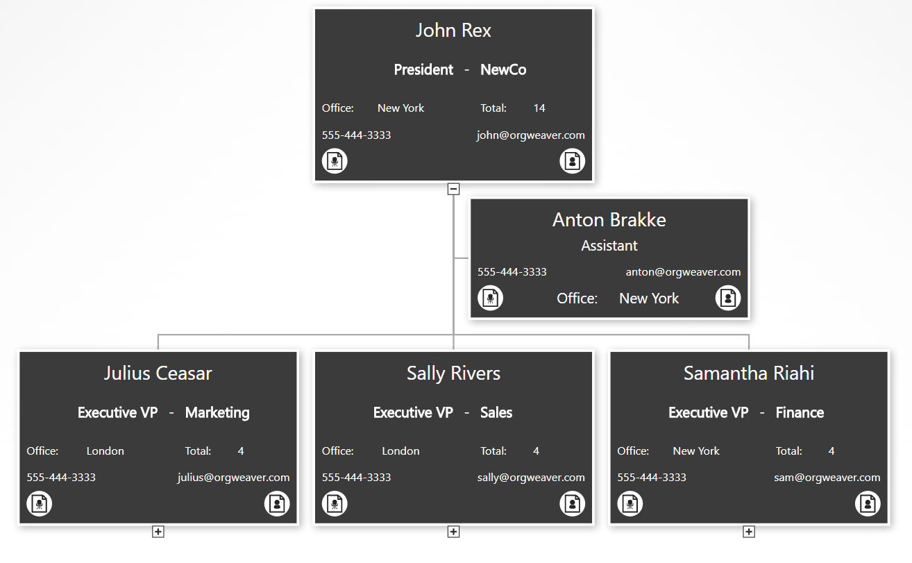
This org chart example gives much more detailed information. As you can see, the core info about the employee and the job title are still there, but we’ve added data about a department/unit, office location, phone email, job description, and employee bio. To make room for it all, we’ve removed the employee photo. Also, we’ve made all of the boxes the same color, but show less info for people that are not managers (see the “Anton Brakke” box).

Org chart software design: Basic branded example

org chart design branded example


This final example built with online org chart software strips away everything to the basics, but uses branded colors instead of neutral colors. This type of org chart can give your team the feeling that it was truly designed for them.