Reporting Relationships Matter to Successful Organizations

Reporting relationships still matter. Sure, there’s a lot of buzzwords about flat hierarchies, dotted-line org charts, and network structures. If those words are confusing, you’re not alone.

reporting relationships matter

The jargon can get annoying. The word “Hierarchy” can be perceived as oppressive. The word “Network” can be perceived as modern. But if you get back to basics, successful organizations have clarity in their reporting relationships, no matter what word they use to describe it.

Problems with unclear reporting relationships

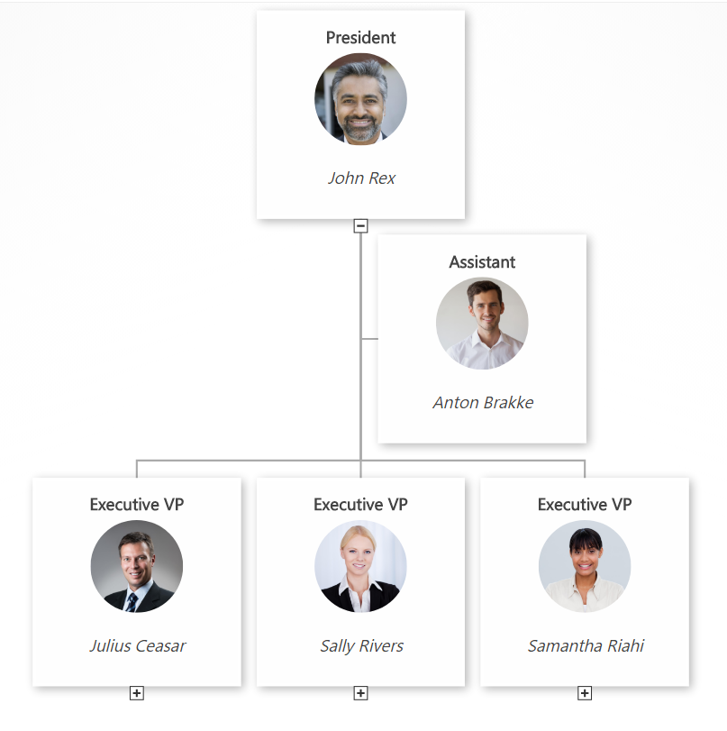
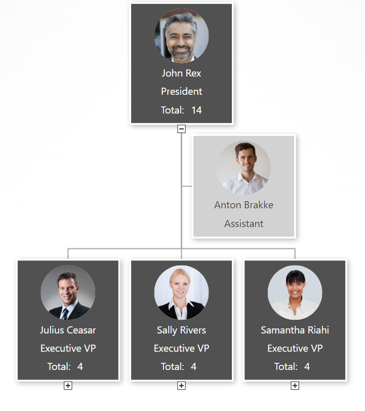
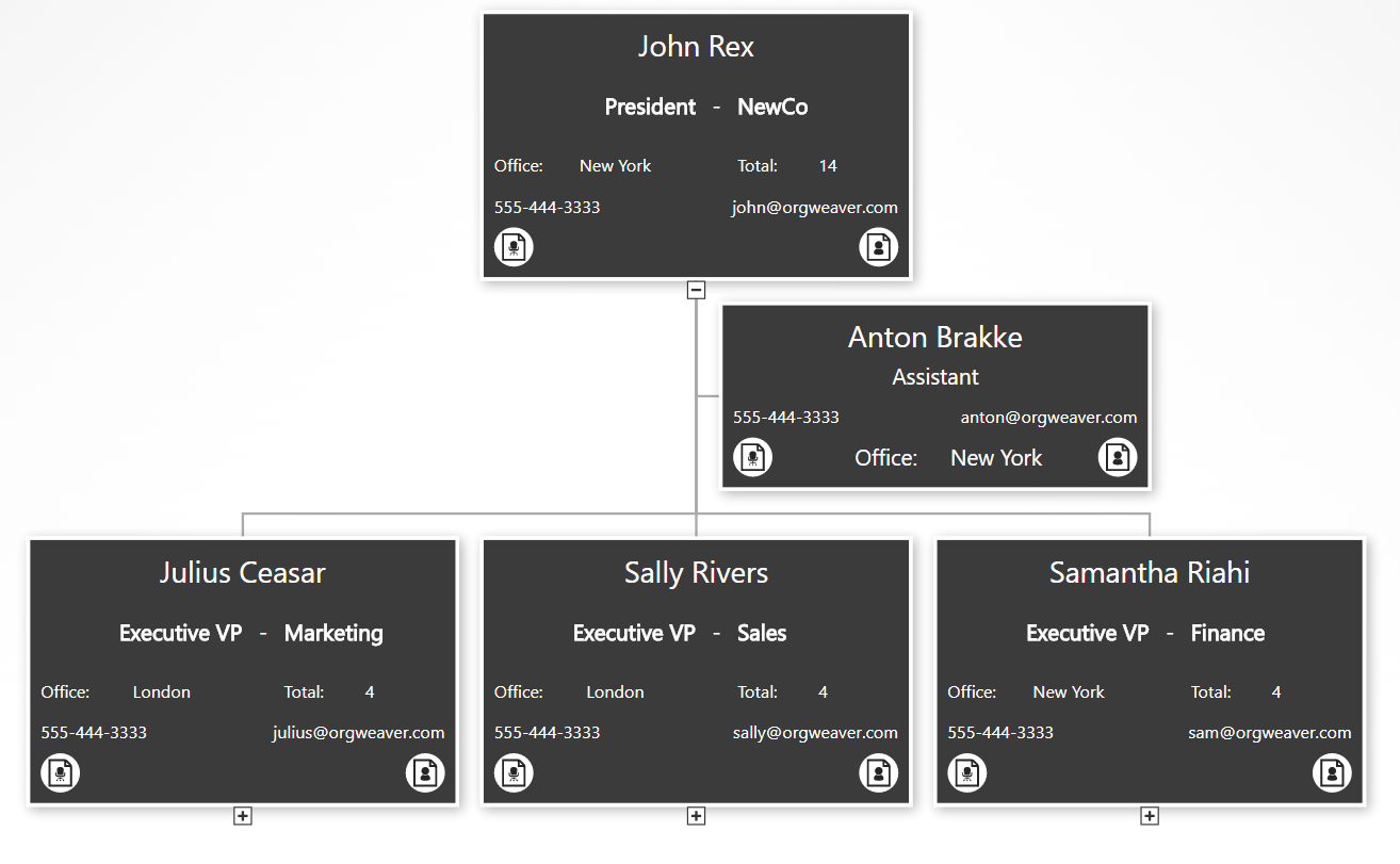
Think about your colleagues. Imagine asking them, “Who do you report to when you finish your top priority task?” Could you build a coherent org chart based on their answers? If not, then you might have problems with unclear reporting lines.

Organizations often come to us because of a major problem with their structure. They often have an org chart that was created in their board room. And then they have a very different undefined org chart based on how their people truly work together. What’s the problem with this situation?

  • Management isn’t connected to how people report to each other
  • Employees don’t understand the official hierarchy, so they get things done their own way
  • Either way, there is a fundamental disconnect that needs to be fixed before the business can improve

Reporting relationships to avoid

Reporting relationship loops

  • Abe reports to Barb who reports to Caroline who reports to Abe.
  • Or to put it another way: A-B-C-A

Disembodied reporting relationships

  • Abe reports to Barb who doesn’t report to anyone
  • This would be: A-B-?

Reverse reporting relationships

  • Barb is the boss, but ends up reporting to Abe about her tasks most of the time
  • Clearly this type of relationship is: B-A

Painful reporting relationships

  • Abe reports to Barb sometimes, Caroline other times, Dan now and then, and Emma often asks what’s going on
  • In other words: A-B,C,D,E

Back to basics reporting relationships

How your people report to each other should be good for everyone. An employee should feel like his tasks matter for a goal bigger than himself and be proud to tell his manager what he accomplished. A manager should be eager to measure the output of her employees and bundle it all together to meet an even bigger goal. Instead of focusing on power and fear, your organization’s reporting lines should focus on completing and measuring meaningful work.

Here’s a quick list to help you get started with better reporting relationships:

  • Focus on one task for one person at time. Clarify who she should report to.
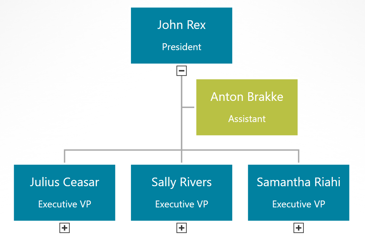
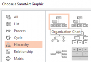
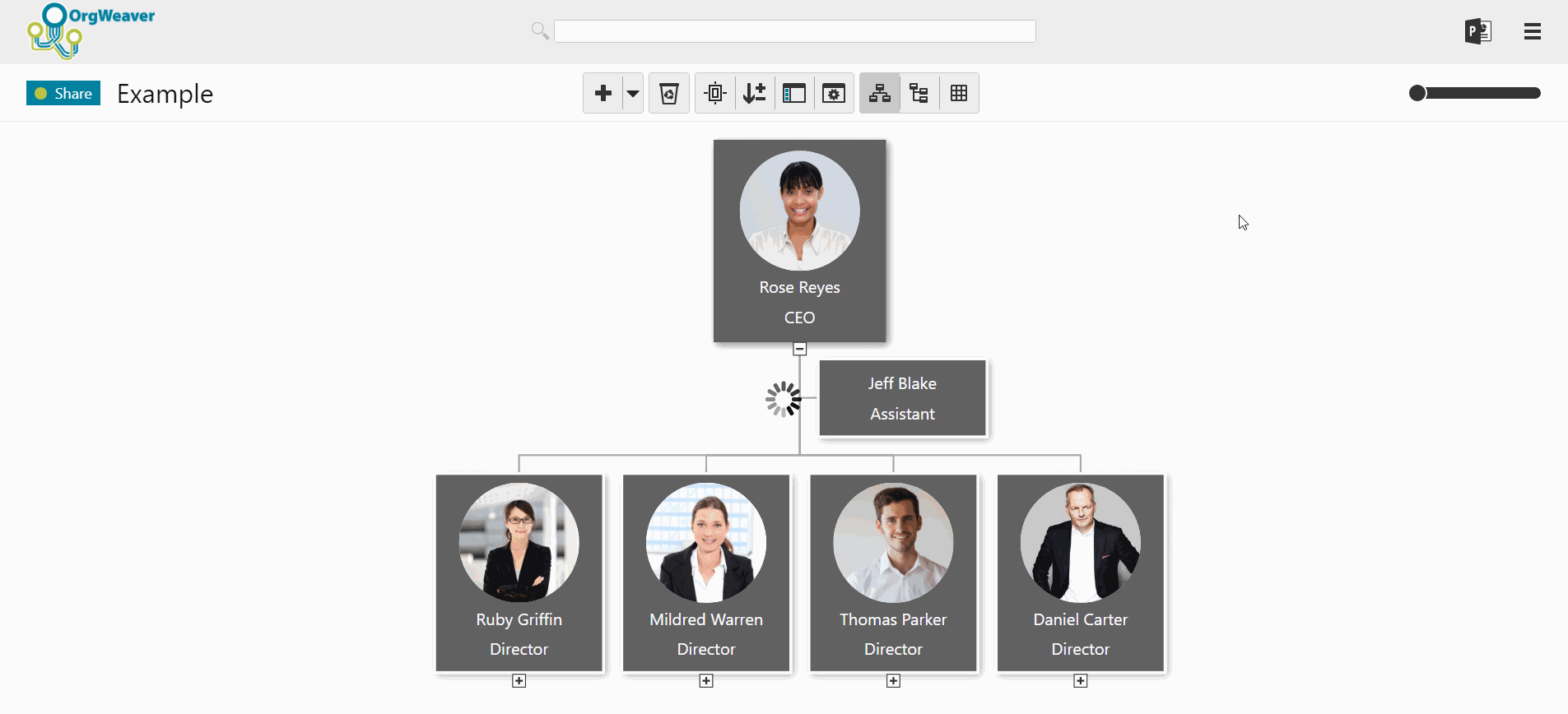
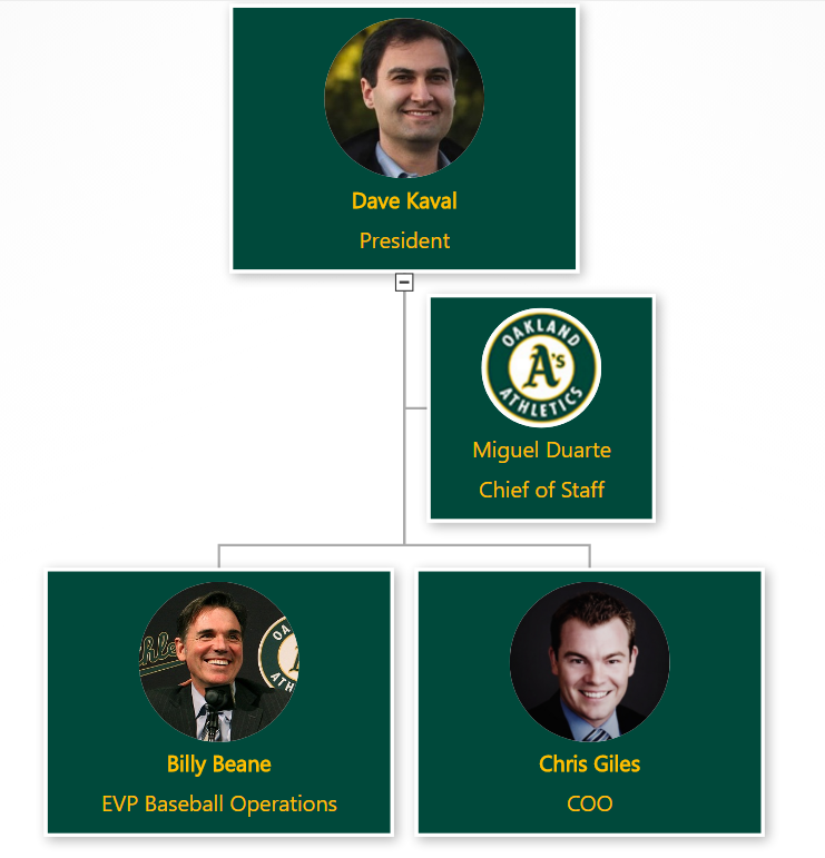
  • Next, draw the reporting relationship (or use an org chart software to save time)
  • Then, show the drawing of the reporting relationships to everyone. Verify it makes sense.
  • Never stop updating the reporting relationships. Your organization is a living ecosystem.

How to create an IT Org Chart for Modern DevOps

Time is running out to make an IT organizational structure that can meet the constant “ideate-build-run” iterations of modern development operations (DevOps).

That’s a mouthful of a sentence, so let me break it down. First up, let’s tackle who is advocating this. Sriram Narayan is an IT Management Consultant at ThoughtWorks who wrote the book on Agile IT Org Design. Recently, Sriram made some slides explaining why it is so important for DevOps to get a new org chart.

Ideate-Build-Run DevOps

Think of DevOps like a city. The person who designs a new road doesn’t build it. And the person who builds the new road doesn’t fill in potholes. That’s what traditional DevOps is like. The problem with this traditional approach is a lack of quality. The designer doesn’t feel the pain of having to maintain what was designed, so designs don’t get better.

Instead, with DevOps, the team who comes up with an idea for an improved software should also build the software and run the software. That’s what Sriram means by “Ideate-Build-Run”.

This goes against more traditional business approaches where specialization is all important. But if specialization doesn’t always lead to better quality products, then it is important to rethink how things get built.

The benefit is that the process is a virtuous loop. The pain of running something gives builders better ideas on how to avoid the pain.

A new normal for DevOps teams

Sriram visualized a four tier concept for structuring DevOps teams. The idea is that each tier of teams has a constant “Ideate-Build-Run” process for their area of DevOps.

devops org design tiers

Time is running out

If you buy in to the idea of Ideate-Build-Run DevOps, then the next questions is “Why now?”.

Every thing is becoming digital. Companies like Amazon would be expected to push the envelope through experimentation. But more traditional companies like Banks usually wait for stacks of best-practice case studies before changing they way they do things. There is not time for this anymore because Banks are digital businesses too, and have to act quickly like the best digital businesses.

In order to implement these core ideas, it’s important to have an org chart software that can easily manage different scenarios and quick changes.

DevOps IT Org Chart

Sriram’s slide inspired me to make an org chart version that clearly shows job titles and reporting structures. Click the org chart below to search and explore the org chart live.

DevOps IT org chart example

Create your own org chart

If you want to apply these organizational structure ideas to your own teams, I’d be glad to send you an example Excel file that you can use to organize your data and then upload to an org chart software like OrgWeaver. Just send an email to nick [at] orgweaver [dotcom] with the subject “Dev Ops org chart template”.

Example: Org Chart Levels for Designers

Peter Merholz literally wrote the book on “Org Design for Design Orgs.” Org design isn’t easy, which is why it’s very helpful to look to experts like Peter before diving into it. In his blog post entitled “Have better career conversations with your design team with this levels framework“, Peter actually shares detailed job descriptions for each level of his design org.

org design level example

The design team role descriptions include:

  • Executive VP
  • Sr. Director
  • Director
  • Sr. Manager / Associate Director
  • Manager
  • Principal
  • Lead
  • Sr. Contributor
  • Key Contributor
  • Associate Contributor

For each role description, Peter outlines these key aspects:

  • Themes
  • Keywords
  • Achievements
  • Delivery
  • Core skills
  • Process/Practice/Planning
  • Problem Solving
  • Scope
  • Communication
  • Presentation
  • Cross-functional Meetings
  • Leadership
  • Relationship with team
  • People Management
  • Recruiting / Hiring

While this is a specific case for one area of a business, the spreadsheet that Peter shares is fascinating for anyone struggling with ways to clearly define roles and organize them into levels.

We often get requests at OrgWeaver to help with visualizing org designs, org levels, and position descriptions. Since Peter was so kind as to share his information with the world, we thought we’d return the favor and visualize his org design online for the world to see. Click the image below to open the interactive online org chart version.

org design levels template

View job descriptions

Within OrgWeaver, it’s easy to view each position description by clicking the document link in the corner of each org chart box. To add position descriptions, we just copied and pasted from Peter’s spreadsheet directly into the org chart.

Organize positions into levels

Based on Peter’s spreadsheet, we added levels for each position in the org chart. Click the expand button at the bottom of the boxes to see lower levels of the org chart. There are of course other ways to define these levels, which is why we built OrgWeaver to easily drag and drop positions into a different hierarchy.

Org chart design: Choose a layout that your team will love

With the right org chart software, you can make the best org chart design. The design of your org chart matters; it’s how your team, new recruits, partners, suppliers, and stakeholders understand who is in charge of what.

If you’re starting with a blank screen in front of you, and don’t know where to start with your org chart design, here are some tips on how to clarify what is most important for your unique team.

Choosing an org chart design

Org charts are made up of boxes that are organized by levels. It sounds simple, but can quickly get complicated if you’re not clear about a few things:

  • Should all org chart boxes include the same information?
    • If yes, then it’s simple to start adding names and titles to your boxes
    • If no, then what boxes need to be different? Should manager boxes have more information (such as headcount, department name, location, phone number, etc.)? Should regular employee boxes be smaller with less information?
    • Tip: Make sure you can edit all boxes at once so you don’t waste time going back and changing hundreds of boxes by hand.
  • Should levels be comparable? For instance, should a “Sr. Manager” in the Sales department be able to visually see that she is on the same level as a “Sr. Manager” in the Finance department?
    • If yes, then be strict with how you place boxes in your org chart.
    • If no, then you can place boxes wherever they fit best on the screen.
  • What colors do you want your org chart boxes to be?
    • Often, a neutral color is easy to read.
    • However, it can be much more personal to use your brand’s official colors.

Org chart software design: Simple white example

org chart design white template example

This org chart design example has a very simple black text layout on white boxes. It’s easy to see that of the 4 people that report to the CEO, three of them are on level 2, and one of them is an assistant without a level. Every box includes the same basic info about job title and employee name. An org chart like this is very easy to glance at and understand.

Org chart software design: Simple gray example

org chart design simple gray example

In this example of an org chart, some different design choices were taken. For example, manager boxes include some extra information about total headcount (automatically calculated by the OrgWeaver org chart software). Also, there is a different color for managers (dark gray) and assistants (light gray) to more strongly differentiate between levels within the org chart.

Org chart software design: Detailed black example

org chart design detailed example

This org chart example gives much more detailed information. As you can see, the core info about the employee and the job title are still there, but we’ve added data about a department/unit, office location, phone email, job description, and employee bio. To make room for it all, we’ve removed the employee photo. Also, we’ve made all of the boxes the same color, but show less info for people that are not managers (see the “Anton Brakke” box).

Org chart software design: Basic branded example

org chart design branded example


This final example built with online org chart software strips away everything to the basics, but uses branded colors instead of neutral colors. This type of org chart can give your team the feeling that it was truly designed for them.

How to create an org chart in PowerPoint

Don’t create an org chart in PowerPoint.

powerpoint org chart limitations

Ok, that’s a little harsh. PowerPoint can be helpful as long as you have realistic expectations. I’ve personally made hundreds of org charts in PowerPoint so I know the limitations first hand. Before you start with PowerPoint to manage your org charts, have an honest conversation about the limitations:

  1. PowerPoint org charts take hours/days to create
  2. Even small change requests often require updating most boxes on many slides
  3. PowerPoint org charts are rarely accurate for more than a week
  4. Only one person can work on a PowerPoint org chart at a time, so it’s difficult to collaborate

If those limitations do not concern you, then PowerPoint can be a nice org chart tool for the following reasons:

  1. Design org chart colors and styles exactly how you want it
  2. Easily print or send via email
  3. If your boss asks for a PowerPoint org chart, then it’s great to deliver a PowerPoint org chart

Now that the warnings are out of the way, here’s how you can make a PowerPoint org chart

Find your official PowerPoint template

  • Many organizations have an official PowerPoint template that has the correct colors, logos, fonts, and styles. If you ask your marketing department, and they have no idea, then you can usually find an official presentation that is used with customers, board members, investors, or other people that your organization wants to impress. Once you find it, just delete all of the slides and then add a new blank slide. Thanks to the power of the “Slide Master” all of the design elements you want for your org chart will be in the new blank slide.

Decide how to split your org chart across slides

  • As tempting as it is to fit your entire org on to one slide, it is very difficult to do in a way that is legible. You’re always giving up clarity and helpful information to maintain the dream of a one-slide org chart.
  • Instead, decide right from the beginning that you will split your org chart across multiple slides. The safest bet is to use 2 levels per slide (for instance, the CEO and the people who report directly to her on one slide). two level powerpoint org chart slide
  • It’s possible you can get 3 levels on one slide, but once you start building it that way, it is a real pain to go back and switch it to just 2 levels per slide.three level powerpoint org chart slide

Make a good title for each slide

  • PowerPoint slides usually have a helpful title at the top to give the reader a quick overview of what they’re looking at. If you have a “task focused structure”, then it’s great to have the unit name at the top (like Sales, or Finance, or Midwest Customer Support).  If you have a culture where people are more important than tasks, then go ahead and make the slide title the name of the person at the top (John Rex, Samantha King, or Mary Charlemagne) powerpoint org chart slide title

Choose what info you want in each org chart box

  • More boxes per slide = Less info per box org chart example detailed text
  • What you put into each org chart box has a huge impact on how many boxes you can fit on each slide. If you want Name, Title, Unit, Email, Responsibilities, Shoe Size, AND a Profile Photo, then you have to have a very small org structure. That is why most org charts you see are limited to just Name and Title.org chart box example limited text
  • When choosing what to add, be aware of your organization’s culture and the limitations of PowerPoint

Use SmartArt in PowerPoint to automatically connect boxes with lines

Ok, decisions are made. Now you are ready to actually build the org chart. Some might recommend that you draw each box and each connector line in your org chart, but that can be frustrating. I recommend using SmartArt so you can build your org chart a little quicker. SmartArt org chart


You can change solid-lines to dotted-lines by selecting the line, right-clicking, selecting Format Shape, selecting Line, and then changing the option for Dash Type.

dotted line org chart

Alternatives to PowerPoint org charts

PowerPoint is just one example of a tool that lets you draw boxes to create an org chart. Other drawing tools include LucidChart, Gliffy, Canva, and Prezi. If the limitations of drawing and updating each org chart box manually are too great for you, then luckily you have some alternative options. Here are the key differences between a drawing tool like PowerPoint and an org chart software:

  • Create an org chart from Excel data
  • Batch edit all org chart box layouts at once
  • Drag and drop to make changes in hierarchy
  • Collaborate online
  • Export to PowerPoint slides automatically
  • Publish dynamic & searchable org charts online

OrgWeaver meets all of those requirements for an org chart software and has a free version to get started. There are other tools as well that don’t meet all of those requirements, but are worth comparing and contrasting (such as OrgPlus, Organimi, and Pingboard).

OrgWeaver org chart software


How the Oakland A’s get more from their organizational structure

Billy Beane is the legendary Executive Vice President of Baseball Operations for the Oakland Athletics. It’s not often one gets played by Brad Pitt in a major motion picture because one takes a “data first” approach to management (Moneyball).  We are strong believers in “data first” here at OrgWeaver when it comes to organizational structures, so we were naturally pleased to be able to help out the Oakland A’s.OrgWeaver org chart software used by Oakland A's

When the senior leadership of the Oakland A’s wanted to make some organizational structure changes, they searched the web to find the best org chart software. Here’s what they needed:

  • Beautiful org chart design (with their team colors)
  • Profile pictures
  • Easy navigation
  • Drag and drop editing
  • Collaboration and sharing
  • Structured data

It was quickly obvious that the typical option for org charts (PowerPoint) wouldn’t meet their needs.

Why PowerPoint is bad for org charts

PowerPoint is great for many things, but not for org charts. It is limited because it is essentially a drawing software. Each org chart box needs to be created one by one. And many times if you want to make a simple change to one org chart box, you have to rearrange all of the other org chart boxes. This makes it too time consuming to explore different organizational structure options. For those of you have have tried to design a complex org structure in PowerPoint, you understand why it always ends up as a dead document that goes unused (because no one wants to spend the time to update it).

Why the Oakland A’s chose OrgWeaver

The short answer is that OrgWeaver is specifically built to handle org charts and is the best org chart software available online. For the long answer, here’s a quote directly from the A’s:

“We needed a dynamic org chart that looks great and is easy to drag and drop. Our goal was to have our senior leadership spec out a new org structure and then share it with the entire team. OrgWeaver has been invaluable in that process. Compared to PowerPoint and a few other options we tried, OrgWeaver is easy to use and does a lot of the hard work for you. I’d definitely recommend it to others who need an org chart software.”

-Dash Davidson, Strategic Assistant to the President, Oakland Athletics

Why org charts matter

The Oakland A’s are not alone in their need to make better org charts. Other sports teams, businesses, and governmental agencies also need to align changes with senior leadership before communicating a new org structure in a way that everyone understands. Org charts matter because they are like a map of how teams work together. Without them, the only way to navigate through an organization is if one personally knows every colleague and their daily tasks.

So, steal a strategy from the Oakland A’s playbook and try OrgWeaver if you agree that org charts matter.

Improve Sales Efficiency: Org Charts For Sales Reps

Is “Sales Efficiency” critical to your 2017 growth plans?

If not, it should be. There is a long list of tasks to do before a deal is signed and an account executive receives a commission. Any of those tasks that are more “administrative” than “customer facing” are robbing your team of growth.

One of those administrative tasks is making an org chart of a prospect’s decision makers. We’re not sales gurus, but Dave Stein is. So we trust him when he says, “An org chart is invaluable in a complex sale.”

Open full org chart example in a new window

Do you already make org charts of prospects? Then gather some metrics on how long it takes you to make an org chart. Get out your favorite org chart tool (probably PowerPoint, let’s be honest) and do this experiment:

  • Start a timer
  • Draw boxes that accurately capture a prospect’s organization structure.
  • Stop the timer
  • Write down the result

Are there any customer facing tasks you would have prefered to accomplish in the same amount of time? Ok, don’t answer that. We think we made our point.

Now that you know it’s worth it to find a better way to create, update, and share org charts for sales processes, what will you do?

Here’s what one account executive did: He searched online, found OrgWeaver, and reached out to us to explain his use case. Turns out, OrgWeaver works great for what he needs:

“OrgWeaver helps me sell more efficiently. I can map out my 20 accounts quickly. I recommend it to anyone who wants to spend less time making accurate org charts.” – Alex, G., Enterprise Account Rep, Software industry
We’d love to hear how you use org chart tools to increase sales efficiency. Connect with us on Facebook.

How to Automatically Build an Org Chart with Data

Making organizational charts is typically done by hand. This seems like a waste of time when most organizations have data that could be used to automatically create org charts.

The trick is to know exactly what data you need. Once you know that, you can compare organization chart software packages that can automatically create all of the boxes and lines you need for your next org chart.

What data do I need to build an org chart?

First, you need everyone’s name in your organization.

  • Make sure each name is split into a columnn for first names and a column for last names. This allows you to decide to show “FirstName LastName”, “LastName, FirstName”,or just “Lastname” in your org chart.
  • Find (or just create) a unique number for each person. Add this to a new column with the headline “Person ID”. This avoids confusion if two people have the same name or one person is in your list twice.

Second, you need all the positions in your organization.

  • In a column next to everyone’s name, add the name of their position. It’s worthwhile to make consistent names. For example, if a group of people are “Vice Presidents”, try to avoid labeling some of them “VP” while others are “V. President” or “V.P.”
  • Just like you did with everyone’s name, find (or create) a unique number for each position.  Add this to a new column with the headline “Position ID”. When so many people have the same position name, it’s important to be clear about the difference between a VP who works with sales in New York and a VP who works with HR in London.

Optionally, you could also add the names of all of the units/departments/divisions in your organization

  • In a column next to all of the position names, you can choose to add the name of the unit that each position is a part of. For instance, Finance, HR, IT, Operations, Sales, etc.
  • Add a unique number to each unit name. Add this to a new column with the headline “Unit ID”. For example, label Finance as number 1, HR as number 2, and so on.

Once my org chart is automatically generated, how to I keep my data up-to-date?


All good org chart software vendors will be sure to separate between the information you provided, and the information that is added automatically by the software. For instance, if you want to export your data from the software, you’ll need to know the original Person ID, Position ID, and Unit ID you created. Likewise, if you want to move data around in the org chart software, it’s very helpful to have another set of ID’s that are unique to the software.

For example, you created a position with the Position ID 33. You’ll need that number to connect that position to your other systems like HR, Finance, or Payroll. But in the org chart software, it’s helpful to have another unique number called “Software Position ID” that can be used in making different scenarios, cloning, or editing.

Understanding your data in OrgWeaver

If you have an OrgWeaver account and want to watch a video explaining how ID’s work specifically in our org chart software, just log-in and click the “Tutorials” button. In tutorials, you’ll find a button called “How your data works”.

Create Organizational Charts in Record time

Who hasn’t seen an org chart at work?

Organizational charts are a vital way to help people understand how their team works together. That’s why bosses keep asking for updated org charts and why employees keep wanting to see where they fit into the grander scheme of the organization. When we were building OrgWeaver, we wanted to make this never-ending org chart creation process simpler and faster.


Org charts are vital, but difficult. Ask anyone who has made an org chart with PowerPoint, Word, Excel, Visio, a whiteboard, or any other tool that’s readily available in an office. Below are some difficulties that a creator of an org chart typically encounters:

Messy data

Org charts can quickly spiral out of control if the purpose isn’t clear. Org charts show reporting relationships. The simplest data you need to create an org chart that shows reporting relationships follows this logic:

  1. Joan is a person who fills the position of Marketing Analyst.
  2. Julie is a person who fills the position of Marketing Manager.
  3. Joan reports to Julie in the unit called Marketing Department.
  4. Therefore, the Marketing Analyst will be shown as an org chart box below the Marketing Manager.

This logic is very intuitive when you draw your organization by hand on a whiteboard. The trick is to make sure that your data is clean and logical so that a computer can understand it and automatically create an org chart based on that logic.

What if you have messy data and it’s too difficult to clean? That’s when people start drawing org chart boxes by hand and waste countless hours.

Too many boxes, too little space

Let’s assume you’ve turned your data into an org chart on a page (either a physical piece of paper, or a screen on your computer). Now comes the trouble of trying to fit everything in so that it makes sense to people. You have several time-consuming choices:

  1. Split the org chart across multiple pages (make sure you’re a pro at cutting and pasting repeatedly)
  2. Make your font size smaller (don’t forget to pass out magnifying glasses with your org chart)
  3. Remove data (hope that your team is good at mind-reading)
  4. Abbreviate data (publish a dictionary of abbreviation definitions along with your org chart)

Any choice you make has it’s problems, but you’re usually left with making some uncomfortable compromises with your org chart.

 yay-10960280-digital.jpg

Political positioning

Logical org charts make sense, but are politically unstable. After you’ve fit everything into your org chart, you might hear comments like these:

  1. “My org chart box is smaller than the other VPs. Make mine bigger because I have a bigger budget”
  2. “My unit is traditionally to the right of the finance unit because we work together on a lot of tasks”
  3. “Even though I don’t technically report to the CEO, I think I should in the org chart because she asks for my advice alot”
  4. “I’m at the same level as John, but he’s on the first page while I’m on the last page. That’s not fair.”

After all of the time you spent just making sure the org chart was functional, these requests for political changes can be very demotivating.

Requests for updates

You’ll also receive lots of requests for practical updates as soon as you’re finished with the political updates. Each request seems small, but they actually have ripple effects across the whole organizational chart. Here are some examples of requests that are easy to say “sure, i’ll do that for you”, but then quickly eat up a day’s work.

  1. Everyone in Unit A who used to be under Unit B now reports to Unit C
  2. We’re adding 6 positions in Sales next quarter. Add the positions now, and we’ll fill in the people later.
  3. Marketing and Communications is split from one unit into two units
  4. Finance is losing a layer of management and these 5 people will by employees instead of managers

Sharing with the right people

Some employee data is too sensitive for employees to see, but is vital for managers to make good decisions. That’s exactly how one org chart quickly needs to be split into many different versions to be shared with different people.

If you thought making one org chart with messy data, limited space, and endless change requests was difficult, imagine doing the same thing four more times. Just when you’re about to throw your hands up, your boss explains again how important this work is for the strategic direction of the company. Like a good team player, you’re back making versions of your org chart like this:

  1. Finance needs an org chart that includes aggregate personnel costs by unit
  2. HR needs an org chart that has detailed employee information
  3. Executives need an org chart that focuses on headcount changes without getting overwhelmed by the details
  4. Employees need an org chart with contact information so that they can better collaborate

Making organizational charts quickly

Cheer up. Making organizational charts doesn’t have to be so difficult. The first step is to be clear-eyed about why you’re making an org chart and who needs to provide input. The next step is to consider trying an org chart software that automatically creates organizational charts from data. If you’re able to securely collaborate with accurate data on the same org chart, you’ll be able to do more with less effort. And in the end, the org chart you make together will be a vital part of the next strategic decision your organization makes.

Updating PowerPoint organizational charts 360x faster

Have you ever been asked to make a small update to an org chart?

At first glance, it seems like such a quick task. There’s no way that “making Sharon’s team report to Joyce” will take much time at all. So, without even realizing you’re about to do something endlessly frustrating, you fire up PowerPoint with your latest org chart.

The first problem hits you in the face. The org structure is too big to fit on one slide. It is split over dozens of slides. Finding Sharon’s part of the org and Joyce’s part of the org and viewing them both on your screen at the same time proves difficult.

No more illusions about this being simple. This will be hard, but you’re set on delivering this for your boss. You try to get through these steps as quickly as possible:

  1. Find all of the boxes that represent Sharon’s organization unit
  2. Cut Sharon’s boxes and connectors
  3. Rearrange the the rest of the boxes on the slide so they look nice
  4. Find all of the boxes that represent Joyce’s organization unit
  5. Make room for Sharon’s boxes on Joyce’s slide
  6. Paste Sharon’s boxes
  7. Adjust all of Sharon and Joyce’s boxes so that they look good and are legible
  8. Go back over every slide to do some “quality assurance”
  9. Save and send the new org chart to your boss
  10. Hope that there are no more “small updates” to your org chart

Is that your experience? If not, I’m starting to doubt you’ve ever worked with an organization chart in PowerPoint before.

If so, then you’re in luck. We did this same task with OrgWeaver in 5 seconds. Watch the video below to find out how OrgWeaver is 360 times faster than PowerPoint in  making this small org chart change. Imagine what OrgWeaver could do for big organization changes.