How to Automatically Build an Org Chart with Data

Making organizational charts is typically done by hand. This seems like a waste of time when most organizations have data that could be used to automatically create org charts.

The trick is to know exactly what data you need. Once you know that, you can compare organization chart software packages that can automatically create all of the boxes and lines you need for your next org chart.

What data do I need to build an org chart?

First, you need everyone’s name in your organization.

  • Make sure each name is split into a columnn for first names and a column for last names. This allows you to decide to show “FirstName LastName”, “LastName, FirstName”,or just “Lastname” in your org chart.
  • Find (or just create) a unique number for each person. Add this to a new column with the headline “Person ID”. This avoids confusion if two people have the same name or one person is in your list twice.

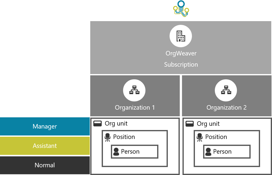
Second, you need all the positions in your organization.

  • In a column next to everyone’s name, add the name of their position. It’s worthwhile to make consistent names. For example, if a group of people are “Vice Presidents”, try to avoid labeling some of them “VP” while others are “V. President” or “V.P.”
  • Just like you did with everyone’s name, find (or create) a unique number for each position.  Add this to a new column with the headline “Position ID”. When so many people have the same position name, it’s important to be clear about the difference between a VP who works with sales in New York and a VP who works with HR in London.

Optionally, you could also add the names of all of the units/departments/divisions in your organization

  • In a column next to all of the position names, you can choose to add the name of the unit that each position is a part of. For instance, Finance, HR, IT, Operations, Sales, etc.
  • Add a unique number to each unit name. Add this to a new column with the headline “Unit ID”. For example, label Finance as number 1, HR as number 2, and so on.

Once my org chart is automatically generated, how to I keep my data up-to-date?


All good org chart software vendors will be sure to separate between the information you provided, and the information that is added automatically by the software. For instance, if you want to export your data from the software, you’ll need to know the original Person ID, Position ID, and Unit ID you created. Likewise, if you want to move data around in the org chart software, it’s very helpful to have another set of ID’s that are unique to the software.

For example, you created a position with the Position ID 33. You’ll need that number to connect that position to your other systems like HR, Finance, or Payroll. But in the org chart software, it’s helpful to have another unique number called “Software Position ID” that can be used in making different scenarios, cloning, or editing.

Understanding your data in OrgWeaver

If you have an OrgWeaver account and want to watch a video explaining how ID’s work specifically in our org chart software, just log-in and click the “Tutorials” button. In tutorials, you’ll find a button called “How your data works”.

Create Organizational Charts in Record time

Who hasn’t seen an org chart at work?

Organizational charts are a vital way to help people understand how their team works together. That’s why bosses keep asking for updated org charts and why employees keep wanting to see where they fit into the grander scheme of the organization. When we were building OrgWeaver, we wanted to make this never-ending org chart creation process simpler and faster.


Org charts are vital, but difficult. Ask anyone who has made an org chart with PowerPoint, Word, Excel, Visio, a whiteboard, or any other tool that’s readily available in an office. Below are some difficulties that a creator of an org chart typically encounters:

Messy data

Org charts can quickly spiral out of control if the purpose isn’t clear. Org charts show reporting relationships. The simplest data you need to create an org chart that shows reporting relationships follows this logic:

  1. Joan is a person who fills the position of Marketing Analyst.
  2. Julie is a person who fills the position of Marketing Manager.
  3. Joan reports to Julie in the unit called Marketing Department.
  4. Therefore, the Marketing Analyst will be shown as an org chart box below the Marketing Manager.

This logic is very intuitive when you draw your organization by hand on a whiteboard. The trick is to make sure that your data is clean and logical so that a computer can understand it and automatically create an org chart based on that logic.

What if you have messy data and it’s too difficult to clean? That’s when people start drawing org chart boxes by hand and waste countless hours.

Too many boxes, too little space

Let’s assume you’ve turned your data into an org chart on a page (either a physical piece of paper, or a screen on your computer). Now comes the trouble of trying to fit everything in so that it makes sense to people. You have several time-consuming choices:

  1. Split the org chart across multiple pages (make sure you’re a pro at cutting and pasting repeatedly)
  2. Make your font size smaller (don’t forget to pass out magnifying glasses with your org chart)
  3. Remove data (hope that your team is good at mind-reading)
  4. Abbreviate data (publish a dictionary of abbreviation definitions along with your org chart)

Any choice you make has it’s problems, but you’re usually left with making some uncomfortable compromises with your org chart.

 yay-10960280-digital.jpg

Political positioning

Logical org charts make sense, but are politically unstable. After you’ve fit everything into your org chart, you might hear comments like these:

  1. “My org chart box is smaller than the other VPs. Make mine bigger because I have a bigger budget”
  2. “My unit is traditionally to the right of the finance unit because we work together on a lot of tasks”
  3. “Even though I don’t technically report to the CEO, I think I should in the org chart because she asks for my advice alot”
  4. “I’m at the same level as John, but he’s on the first page while I’m on the last page. That’s not fair.”

After all of the time you spent just making sure the org chart was functional, these requests for political changes can be very demotivating.

Requests for updates

You’ll also receive lots of requests for practical updates as soon as you’re finished with the political updates. Each request seems small, but they actually have ripple effects across the whole organizational chart. Here are some examples of requests that are easy to say “sure, i’ll do that for you”, but then quickly eat up a day’s work.

  1. Everyone in Unit A who used to be under Unit B now reports to Unit C
  2. We’re adding 6 positions in Sales next quarter. Add the positions now, and we’ll fill in the people later.
  3. Marketing and Communications is split from one unit into two units
  4. Finance is losing a layer of management and these 5 people will by employees instead of managers

Sharing with the right people

Some employee data is too sensitive for employees to see, but is vital for managers to make good decisions. That’s exactly how one org chart quickly needs to be split into many different versions to be shared with different people.

If you thought making one org chart with messy data, limited space, and endless change requests was difficult, imagine doing the same thing four more times. Just when you’re about to throw your hands up, your boss explains again how important this work is for the strategic direction of the company. Like a good team player, you’re back making versions of your org chart like this:

  1. Finance needs an org chart that includes aggregate personnel costs by unit
  2. HR needs an org chart that has detailed employee information
  3. Executives need an org chart that focuses on headcount changes without getting overwhelmed by the details
  4. Employees need an org chart with contact information so that they can better collaborate

Making organizational charts quickly

Cheer up. Making organizational charts doesn’t have to be so difficult. The first step is to be clear-eyed about why you’re making an org chart and who needs to provide input. The next step is to consider trying an org chart software that automatically creates organizational charts from data. If you’re able to securely collaborate with accurate data on the same org chart, you’ll be able to do more with less effort. And in the end, the org chart you make together will be a vital part of the next strategic decision your organization makes.

Updating PowerPoint organizational charts 360x faster

Have you ever been asked to make a small update to an org chart?

At first glance, it seems like such a quick task. There’s no way that “making Sharon’s team report to Joyce” will take much time at all. So, without even realizing you’re about to do something endlessly frustrating, you fire up PowerPoint with your latest org chart.

The first problem hits you in the face. The org structure is too big to fit on one slide. It is split over dozens of slides. Finding Sharon’s part of the org and Joyce’s part of the org and viewing them both on your screen at the same time proves difficult.

No more illusions about this being simple. This will be hard, but you’re set on delivering this for your boss. You try to get through these steps as quickly as possible:

  1. Find all of the boxes that represent Sharon’s organization unit
  2. Cut Sharon’s boxes and connectors
  3. Rearrange the the rest of the boxes on the slide so they look nice
  4. Find all of the boxes that represent Joyce’s organization unit
  5. Make room for Sharon’s boxes on Joyce’s slide
  6. Paste Sharon’s boxes
  7. Adjust all of Sharon and Joyce’s boxes so that they look good and are legible
  8. Go back over every slide to do some “quality assurance”
  9. Save and send the new org chart to your boss
  10. Hope that there are no more “small updates” to your org chart

Is that your experience? If not, I’m starting to doubt you’ve ever worked with an organization chart in PowerPoint before.

If so, then you’re in luck. We did this same task with OrgWeaver in 5 seconds. Watch the video below to find out how OrgWeaver is 360 times faster than PowerPoint in  making this small org chart change. Imagine what OrgWeaver could do for big organization changes.