
Posts
Org chart design: Choose a layout that your team will love
With the right org chart software, you can make the best org chart design. The design of your org chart matters; it’s how your team, new recruits, partners, suppliers, and stakeholders understand who is in charge of what.
If you’re starting with a blank screen in front of you, and don’t know where to start with your org chart design, here are some tips on how to clarify what is most important for your unique team.
Choosing an org chart design
Org charts are made up of boxes that are organized by levels. It sounds simple, but can quickly get complicated if you’re not clear about a few things:
- Should all org chart boxes include the same information?
- If yes, then it’s simple to start adding names and titles to your boxes
- If no, then what boxes need to be different? Should manager boxes have more information (such as headcount, department name, location, phone number, etc.)? Should regular employee boxes be smaller with less information?
- Tip: Make sure you can edit all boxes at once so you don’t waste time going back and changing hundreds of boxes by hand.
- Should levels be comparable? For instance, should a “Sr. Manager” in the Sales department be able to visually see that she is on the same level as a “Sr. Manager” in the Finance department?
- If yes, then be strict with how you place boxes in your org chart.
- If no, then you can place boxes wherever they fit best on the screen.
- What colors do you want your org chart boxes to be?
- Often, a neutral color is easy to read.
- However, it can be much more personal to use your brand’s official colors.
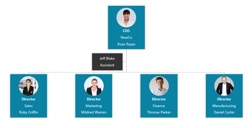
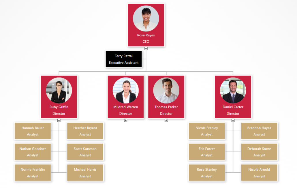
Org chart software design: Simple white example
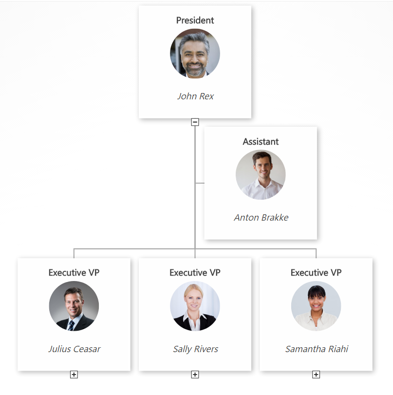
This org chart design example has a very simple black text layout on white boxes. It’s easy to see that of the 4 people that report to the CEO, three of them are on level 2, and one of them is an assistant without a level. Every box includes the same basic info about job title and employee name. An org chart like this is very easy to glance at and understand.
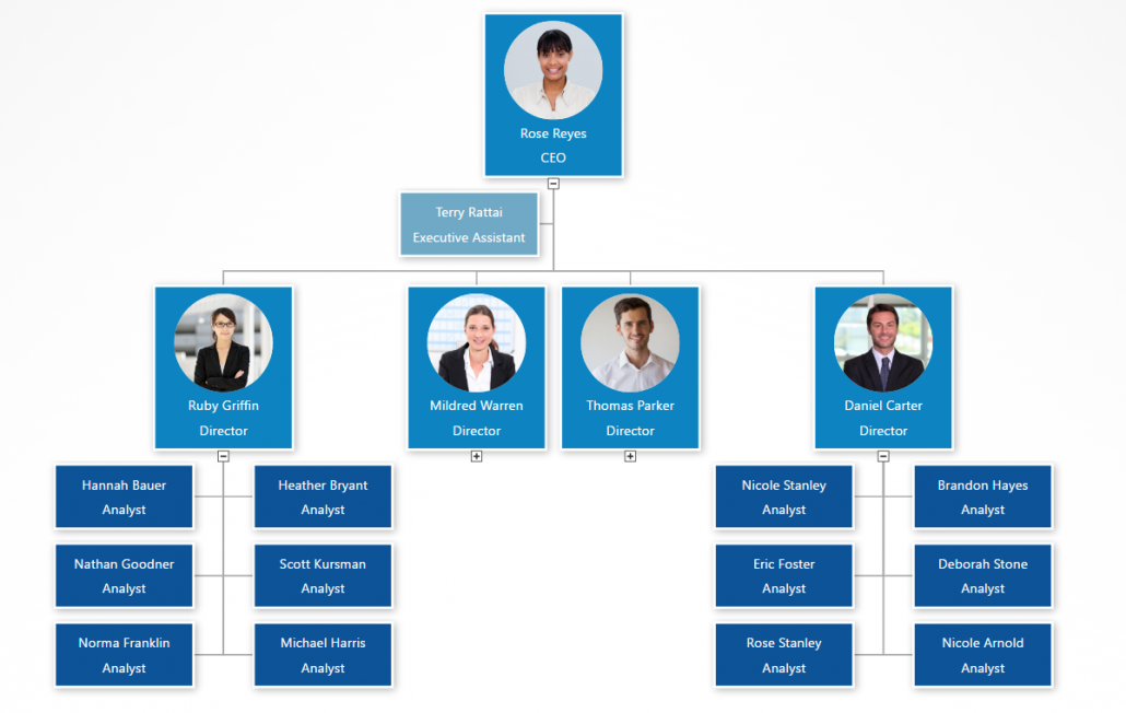
Org chart software design: Simple gray example
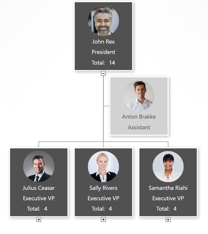
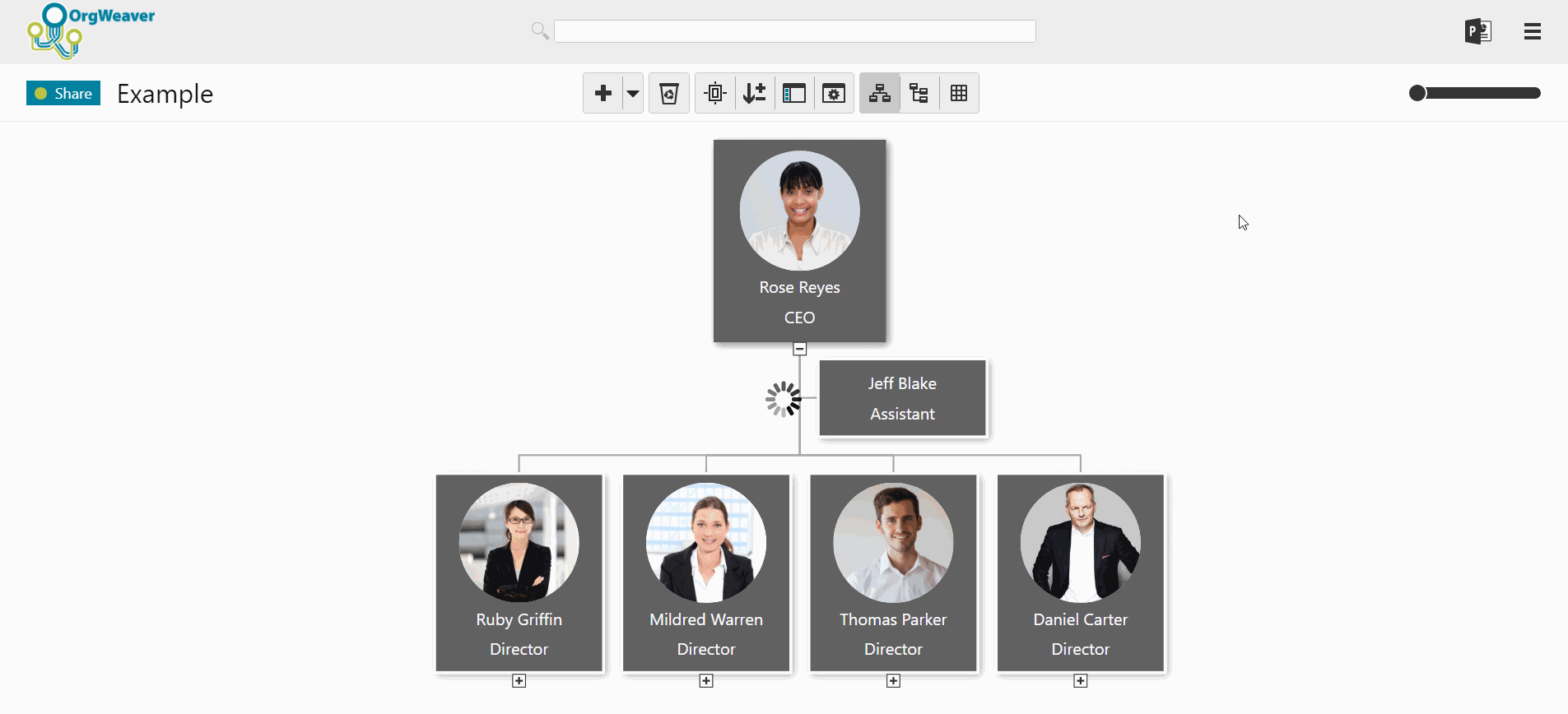
In this example of an org chart, some different design choices were taken. For example, manager boxes include some extra information about total headcount (automatically calculated by the OrgWeaver org chart software). Also, there is a different color for managers (dark gray) and assistants (light gray) to more strongly differentiate between levels within the org chart.
Org chart software design: Detailed black example
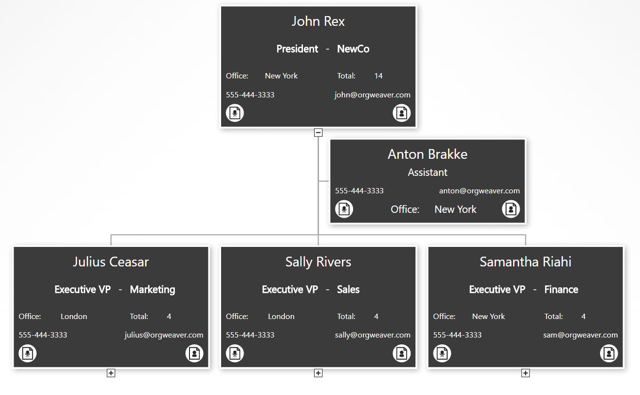
This org chart example gives much more detailed information. As you can see, the core info about the employee and the job title are still there, but we’ve added data about a department/unit, office location, phone email, job description, and employee bio. To make room for it all, we’ve removed the employee photo. Also, we’ve made all of the boxes the same color, but show less info for people that are not managers (see the “Anton Brakke” box).
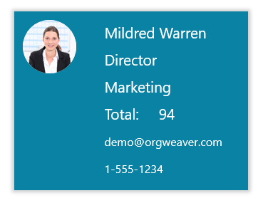
Org chart software design: Basic branded example
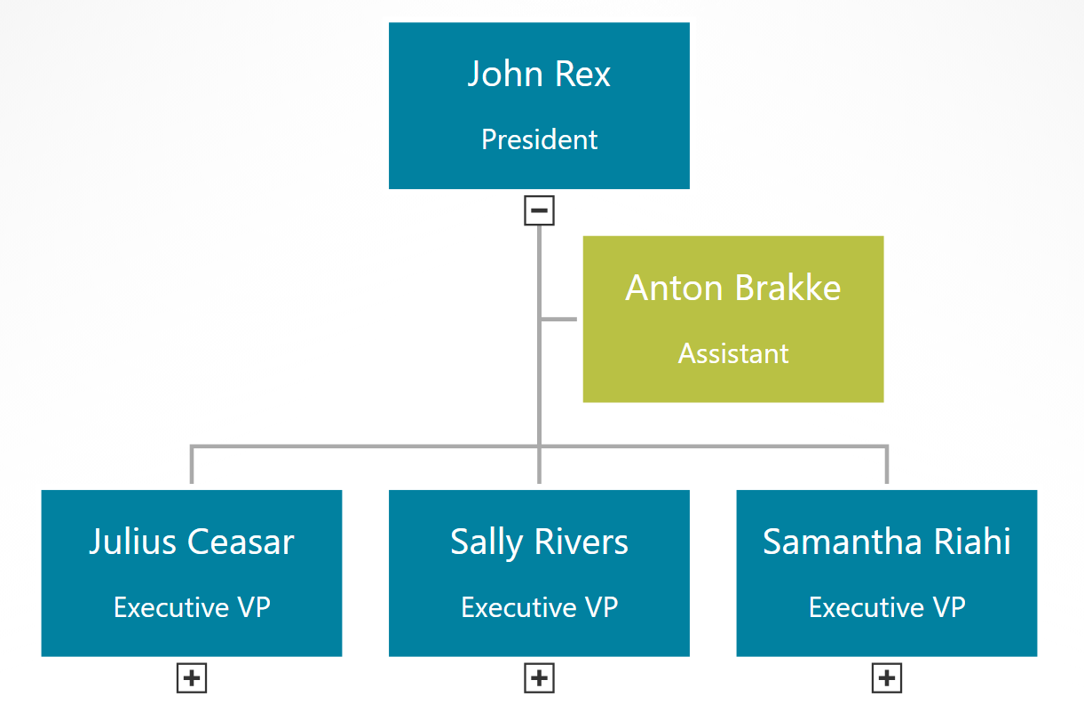
This final example built with online org chart software strips away everything to the basics, but uses branded colors instead of neutral colors. This type of org chart can give your team the feeling that it was truly designed for them.
How to create an org chart in PowerPoint
Don’t create an org chart in PowerPoint.

Ok, that’s a little harsh. PowerPoint can be helpful as long as you have realistic expectations. I’ve personally made hundreds of org charts in PowerPoint so I know the limitations first hand. Before you start with PowerPoint to manage your org charts, have an honest conversation about the limitations:
- PowerPoint org charts take hours/days to create
- Even small change requests often require updating most boxes on many slides
- PowerPoint org charts are rarely accurate for more than a week
- Only one person can work on a PowerPoint org chart at a time, so it’s difficult to collaborate
If those limitations do not concern you, then PowerPoint can be a nice org chart tool for the following reasons:
- Design org chart colors and styles exactly how you want it
- Easily print or send via email
- If your boss asks for a PowerPoint org chart, then it’s great to deliver a PowerPoint org chart
Now that the warnings are out of the way, here’s how you can make a PowerPoint org chart
Find your official PowerPoint template
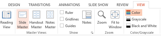
- Many organizations have an official PowerPoint template that has the correct colors, logos, fonts, and styles. If you ask your marketing department, and they have no idea, then you can usually find an official presentation that is used with customers, board members, investors, or other people that your organization wants to impress. Once you find it, just delete all of the slides and then add a new blank slide. Thanks to the power of the “Slide Master” all of the design elements you want for your org chart will be in the new blank slide.
Decide how to split your org chart across slides
- As tempting as it is to fit your entire org on to one slide, it is very difficult to do in a way that is legible. You’re always giving up clarity and helpful information to maintain the dream of a one-slide org chart.
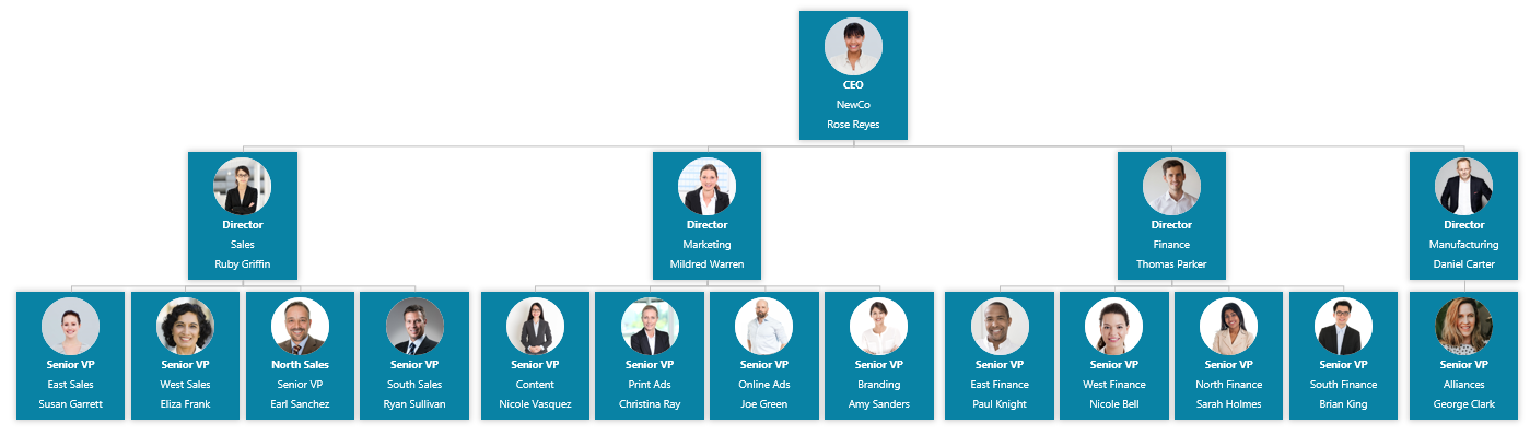
- Instead, decide right from the beginning that you will split your org chart across multiple slides. The safest bet is to use 2 levels per slide (for instance, the CEO and the people who report directly to her on one slide).
- It’s possible you can get 3 levels on one slide, but once you start building it that way, it is a real pain to go back and switch it to just 2 levels per slide.
Make a good title for each slide
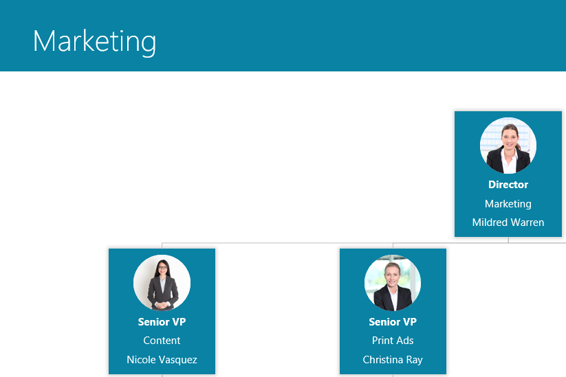
- PowerPoint slides usually have a helpful title at the top to give the reader a quick overview of what they’re looking at. If you have a “task focused structure”, then it’s great to have the unit name at the top (like Sales, or Finance, or Midwest Customer Support). If you have a culture where people are more important than tasks, then go ahead and make the slide title the name of the person at the top (John Rex, Samantha King, or Mary Charlemagne)
Choose what info you want in each org chart box
- More boxes per slide = Less info per box
- What you put into each org chart box has a huge impact on how many boxes you can fit on each slide. If you want Name, Title, Unit, Email, Responsibilities, Shoe Size, AND a Profile Photo, then you have to have a very small org structure. That is why most org charts you see are limited to just Name and Title.

- When choosing what to add, be aware of your organization’s culture and the limitations of PowerPoint
Use SmartArt in PowerPoint to automatically connect boxes with lines
Ok, decisions are made. Now you are ready to actually build the org chart. Some might recommend that you draw each box and each connector line in your org chart, but that can be frustrating. I recommend using SmartArt so you can build your org chart a little quicker. 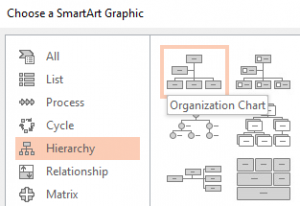
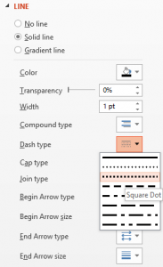
You can change solid-lines to dotted-lines by selecting the line, right-clicking, selecting Format Shape, selecting Line, and then changing the option for Dash Type.
Alternatives to PowerPoint org charts
PowerPoint is just one example of a tool that lets you draw boxes to create an org chart. Other drawing tools include LucidChart, Gliffy, Canva, and Prezi. If the limitations of drawing and updating each org chart box manually are too great for you, then luckily you have some alternative options. Here are the key differences between a drawing tool like PowerPoint and an org chart software:
- Create an org chart from Excel data
- Batch edit all org chart box layouts at once
- Drag and drop to make changes in hierarchy
- Collaborate online
- Export to PowerPoint slides automatically
- Publish dynamic & searchable org charts online
OrgWeaver meets all of those requirements for an org chart software and has a free version to get started. There are other tools as well that don’t meet all of those requirements, but are worth comparing and contrasting (such as OrgPlus, Organimi, and Pingboard).
How to add org chart colors that fit your brand
Take the time to color your org chart to fit your brand identity and styles. Organizational charts are everywhere, but rarely make people say “Wow!”. For the same reason that web designers agonize over color palettes, your org chart could have much more impact with the right colors and styles. Here’s a quick overview of how to do it and some examples of OrgWeaver org charts that are perfectly color matched to some of the world’s most recognized brands.
Find your brand’s official colors
- Many well-known brands have their colors available online. Try Brand Colors
- Or add a color picker to your Chrome browser (like Colorzilla) and pick your brand’s colors directly from your website
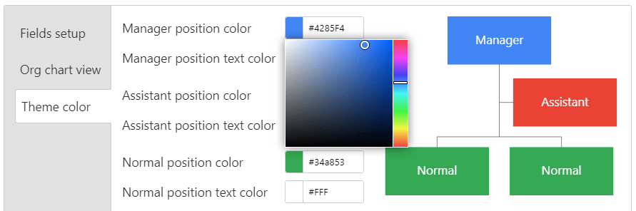
- Copy the Hex code for each color you want to use in your org chart (here’s an example of a Hex code for Google’s blue brand color: #4285F4)
Add colors to your org chart software
- Open OrgWeaver org chart software
- Go to the area where you can edit your org chart and change the org chart color theme by pasting in the Hex color codes of your brand. You can also just pick a color w
Change styles of your org chart
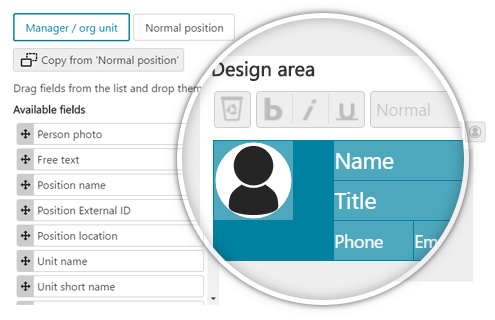
- Choose how much data to show in each org chart box. Focus on just profile photos, names, and titles, or get more detailed with contact info, unit name, position description, and much more.
- Drag and drop each piece of data so they fit perfectly in the org chart box. Save one style that automatically updates hundreds of org chart boxes.
Org chart color examples
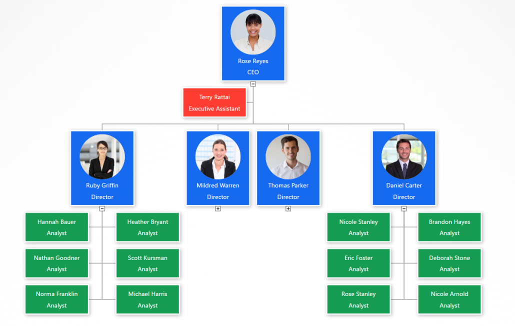
Blue and green org chart like Google’s brand
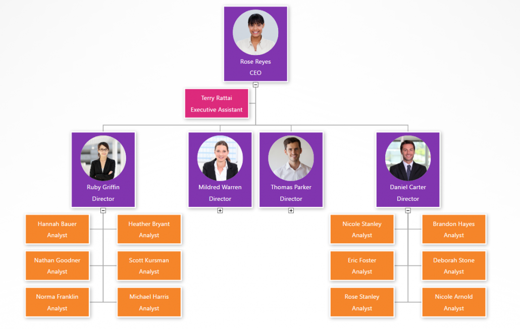
Purple org chart colors like Instagram’s brand
Red and gold org chart colors like the 49er’s brand
Simple blue org chart colors
Convinced that adding your official colors to your org chart could have more impact? Then go find your brand’s Hex colors right away. If you don’t have a great org chart software yet, then get started creating a colorful org chart with OrgWeaver for free.
How the Oakland A’s get more from their organizational structure
Billy Beane is the legendary Executive Vice President of Baseball Operations for the Oakland Athletics. It’s not often one gets played by Brad Pitt in a major motion picture because one takes a “data first” approach to management (Moneyball). We are strong believers in “data first” here at OrgWeaver when it comes to organizational structures, so we were naturally pleased to be able to help out the Oakland A’s.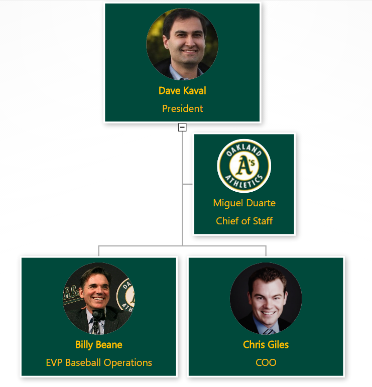
When the senior leadership of the Oakland A’s wanted to make some organizational structure changes, they searched the web to find the best org chart software. Here’s what they needed:
- Beautiful org chart design (with their team colors)
- Profile pictures
- Easy navigation
- Drag and drop editing
- Collaboration and sharing
- Structured data
It was quickly obvious that the typical option for org charts (PowerPoint) wouldn’t meet their needs.
Why PowerPoint is bad for org charts
PowerPoint is great for many things, but not for org charts. It is limited because it is essentially a drawing software. Each org chart box needs to be created one by one. And many times if you want to make a simple change to one org chart box, you have to rearrange all of the other org chart boxes. This makes it too time consuming to explore different organizational structure options. For those of you have have tried to design a complex org structure in PowerPoint, you understand why it always ends up as a dead document that goes unused (because no one wants to spend the time to update it).
Why the Oakland A’s chose OrgWeaver
The short answer is that OrgWeaver is specifically built to handle org charts and is the best org chart software available online. For the long answer, here’s a quote directly from the A’s:
“We needed a dynamic org chart that looks great and is easy to drag and drop. Our goal was to have our senior leadership spec out a new org structure and then share it with the entire team. OrgWeaver has been invaluable in that process. Compared to PowerPoint and a few other options we tried, OrgWeaver is easy to use and does a lot of the hard work for you. I’d definitely recommend it to others who need an org chart software.”
-Dash Davidson, Strategic Assistant to the President, Oakland Athletics
Why org charts matter
The Oakland A’s are not alone in their need to make better org charts. Other sports teams, businesses, and governmental agencies also need to align changes with senior leadership before communicating a new org structure in a way that everyone understands. Org charts matter because they are like a map of how teams work together. Without them, the only way to navigate through an organization is if one personally knows every colleague and their daily tasks.
So, steal a strategy from the Oakland A’s playbook and try OrgWeaver if you agree that org charts matter.