Reporting Relationships Matter to Successful Organizations

Reporting relationships still matter. Sure, there’s a lot of buzzwords about flat hierarchies, dotted-line org charts, and network structures. If those words are confusing, you’re not alone.

reporting relationships matter

The jargon can get annoying. The word “Hierarchy” can be perceived as oppressive. The word “Network” can be perceived as modern. But if you get back to basics, successful organizations have clarity in their reporting relationships, no matter what word they use to describe it.

Problems with unclear reporting relationships

Think about your colleagues. Imagine asking them, “Who do you report to when you finish your top priority task?” Could you build a coherent org chart based on their answers? If not, then you might have problems with unclear reporting lines.

Organizations often come to us because of a major problem with their structure. They often have an org chart that was created in their board room. And then they have a very different undefined org chart based on how their people truly work together. What’s the problem with this situation?

  • Management isn’t connected to how people report to each other
  • Employees don’t understand the official hierarchy, so they get things done their own way
  • Either way, there is a fundamental disconnect that needs to be fixed before the business can improve

Reporting relationships to avoid

Reporting relationship loops

  • Abe reports to Barb who reports to Caroline who reports to Abe.
  • Or to put it another way: A-B-C-A

Disembodied reporting relationships

  • Abe reports to Barb who doesn’t report to anyone
  • This would be: A-B-?

Reverse reporting relationships

  • Barb is the boss, but ends up reporting to Abe about her tasks most of the time
  • Clearly this type of relationship is: B-A

Painful reporting relationships

  • Abe reports to Barb sometimes, Caroline other times, Dan now and then, and Emma often asks what’s going on
  • In other words: A-B,C,D,E

Back to basics reporting relationships

How your people report to each other should be good for everyone. An employee should feel like his tasks matter for a goal bigger than himself and be proud to tell his manager what he accomplished. A manager should be eager to measure the output of her employees and bundle it all together to meet an even bigger goal. Instead of focusing on power and fear, your organization’s reporting lines should focus on completing and measuring meaningful work.

Here’s a quick list to help you get started with better reporting relationships:

  • Focus on one task for one person at time. Clarify who she should report to.
  • Next, draw the reporting relationship (or use an org chart software to save time)
  • Then, show the drawing of the reporting relationships to everyone. Verify it makes sense.
  • Never stop updating the reporting relationships. Your organization is a living ecosystem.
How to Embed an Org Chart Online

Org charts usually get shared as a PDF, which is static and a little boring. But what if you could embed an online org chart on your website or intranet? It would bring your org charts to life in a way that was previously not possible.Embed org chart online instead of printing PDF

Here’s how to get started with embedding an org chart:

  1. Log in to your preferred org chart software. In this case, we’re using OrgWeaver and Organimi as examples.
  2. Share a public version of your org chart. You’ll need a URL that looks something like this: https://app.orgweaver.com/pub/XPKKSJ
  3. Create an embed code using an iFrame that will look something like this: “<iframe src=”https://app.orgweaver.com/pub/XPKKSJ” height=”600px” width=”800px”></iframe>”
  4. Paste the iFrame code within the <body> tag on your website. If you don’t know how to do that, then reach out to whoever runs your intranet or website (they’ll know what to do)

Troubleshooting iFrame org chart embeds

  • Some online org charts won’t allow you to use an iFrame. To check on your own, enter the URL of the org chart software you’re trying to use at this iFrame checker. If there are errors, then you’ll have to contact your org chart software vendor.
  • There are many different iFrame settings that are available. Try using an iFrame generator to explore different options to make your org chart look great in an iFrame.
  • Make sure that both your website, and the online org chart are using HTTPS instead of HTTP

Embedded org chart example

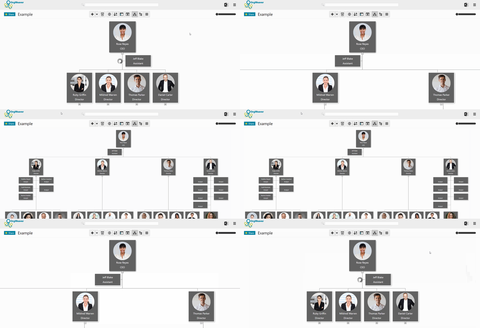
Try to do the following with this embedded org chart from OrgWeaver:

  • Expand/collapse org chart levels
  • Use your mouse to move the org chart
  • Zoom in and out

Org chart design: Choose a layout that your team will love

With the right org chart software, you can make the best org chart design. The design of your org chart matters; it’s how your team, new recruits, partners, suppliers, and stakeholders understand who is in charge of what.

If you’re starting with a blank screen in front of you, and don’t know where to start with your org chart design, here are some tips on how to clarify what is most important for your unique team.

Choosing an org chart design

Org charts are made up of boxes that are organized by levels. It sounds simple, but can quickly get complicated if you’re not clear about a few things:

  • Should all org chart boxes include the same information?
    • If yes, then it’s simple to start adding names and titles to your boxes
    • If no, then what boxes need to be different? Should manager boxes have more information (such as headcount, department name, location, phone number, etc.)? Should regular employee boxes be smaller with less information?
    • Tip: Make sure you can edit all boxes at once so you don’t waste time going back and changing hundreds of boxes by hand.
  • Should levels be comparable? For instance, should a “Sr. Manager” in the Sales department be able to visually see that she is on the same level as a “Sr. Manager” in the Finance department?
    • If yes, then be strict with how you place boxes in your org chart.
    • If no, then you can place boxes wherever they fit best on the screen.
  • What colors do you want your org chart boxes to be?
    • Often, a neutral color is easy to read.
    • However, it can be much more personal to use your brand’s official colors.

Org chart software design: Simple white example

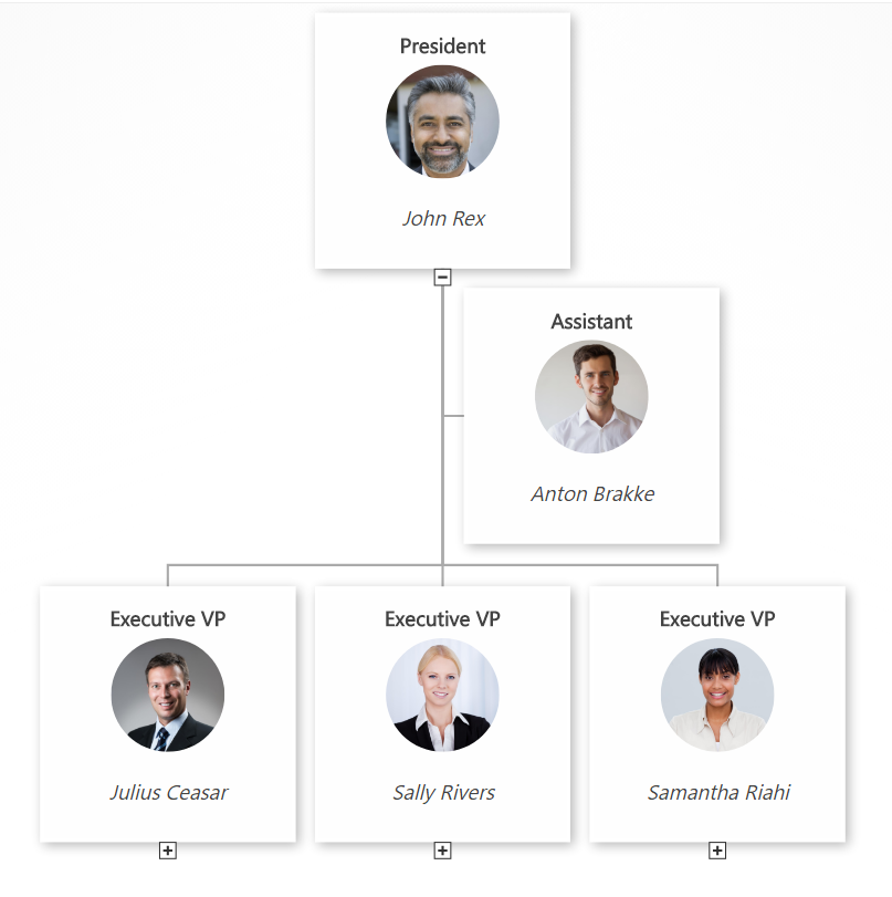
org chart design white template example

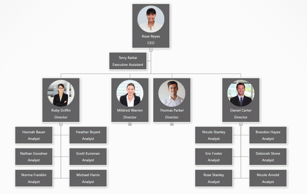
This org chart design example has a very simple black text layout on white boxes. It’s easy to see that of the 4 people that report to the CEO, three of them are on level 2, and one of them is an assistant without a level. Every box includes the same basic info about job title and employee name. An org chart like this is very easy to glance at and understand.

Org chart software design: Simple gray example

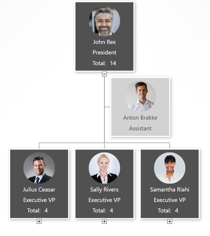
org chart design simple gray example

In this example of an org chart, some different design choices were taken. For example, manager boxes include some extra information about total headcount (automatically calculated by the OrgWeaver org chart software). Also, there is a different color for managers (dark gray) and assistants (light gray) to more strongly differentiate between levels within the org chart.

Org chart software design: Detailed black example

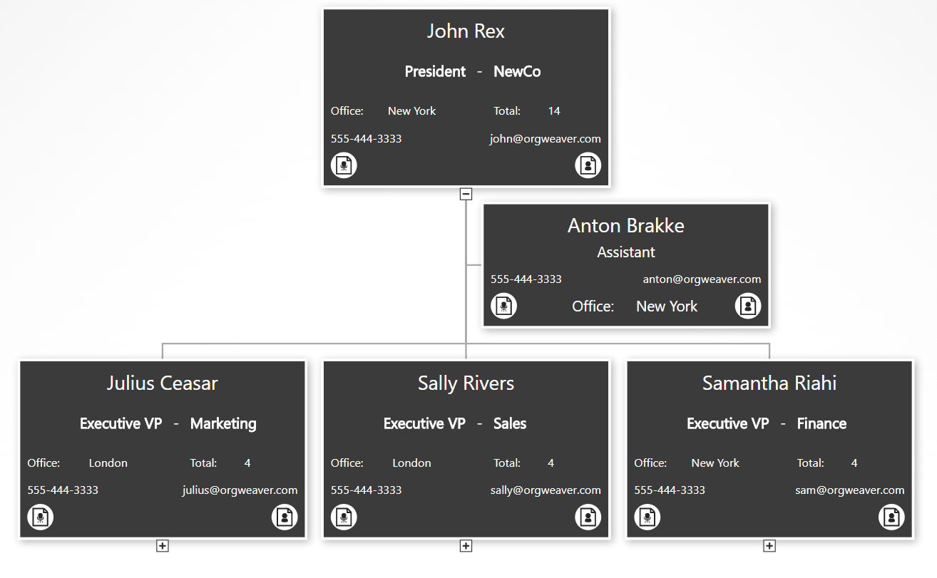
org chart design detailed example

This org chart example gives much more detailed information. As you can see, the core info about the employee and the job title are still there, but we’ve added data about a department/unit, office location, phone email, job description, and employee bio. To make room for it all, we’ve removed the employee photo. Also, we’ve made all of the boxes the same color, but show less info for people that are not managers (see the “Anton Brakke” box).

Org chart software design: Basic branded example

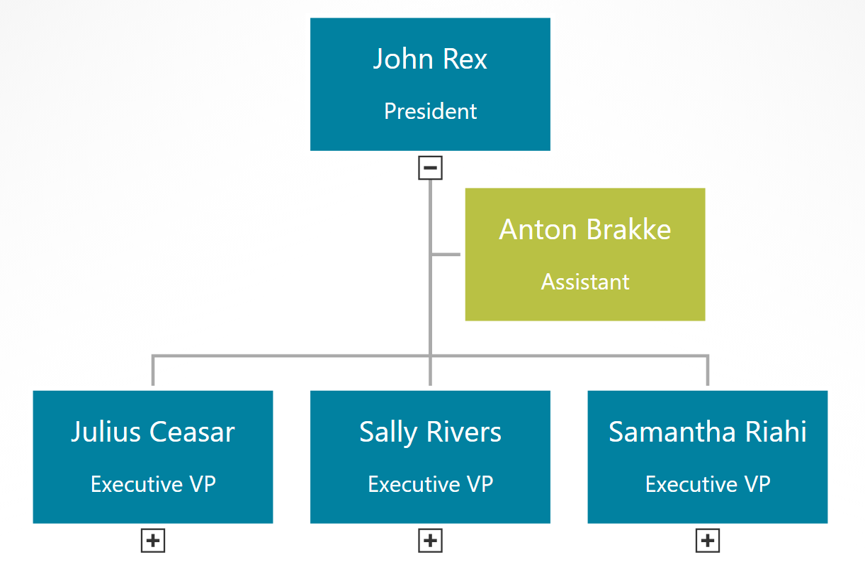
org chart design branded example


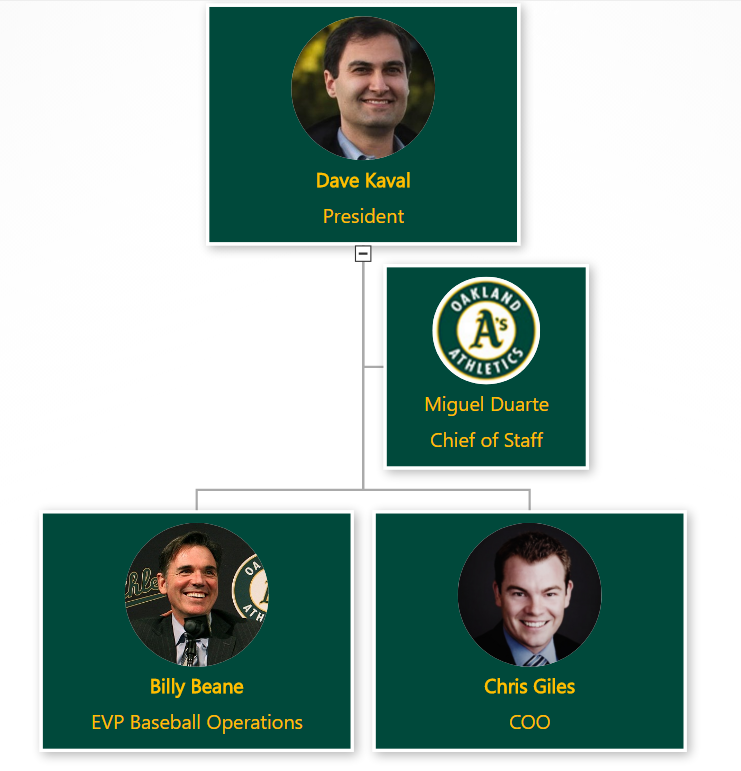
This final example built with online org chart software strips away everything to the basics, but uses branded colors instead of neutral colors. This type of org chart can give your team the feeling that it was truly designed for them.

How to create an org chart in PowerPoint

Don’t create an org chart in PowerPoint.

powerpoint org chart limitations

Ok, that’s a little harsh. PowerPoint can be helpful as long as you have realistic expectations. I’ve personally made hundreds of org charts in PowerPoint so I know the limitations first hand. Before you start with PowerPoint to manage your org charts, have an honest conversation about the limitations:

  1. PowerPoint org charts take hours/days to create
  2. Even small change requests often require updating most boxes on many slides
  3. PowerPoint org charts are rarely accurate for more than a week
  4. Only one person can work on a PowerPoint org chart at a time, so it’s difficult to collaborate

If those limitations do not concern you, then PowerPoint can be a nice org chart tool for the following reasons:

  1. Design org chart colors and styles exactly how you want it
  2. Easily print or send via email
  3. If your boss asks for a PowerPoint org chart, then it’s great to deliver a PowerPoint org chart

Now that the warnings are out of the way, here’s how you can make a PowerPoint org chart

Find your official PowerPoint template

  • Many organizations have an official PowerPoint template that has the correct colors, logos, fonts, and styles. If you ask your marketing department, and they have no idea, then you can usually find an official presentation that is used with customers, board members, investors, or other people that your organization wants to impress. Once you find it, just delete all of the slides and then add a new blank slide. Thanks to the power of the “Slide Master” all of the design elements you want for your org chart will be in the new blank slide.

Decide how to split your org chart across slides

  • As tempting as it is to fit your entire org on to one slide, it is very difficult to do in a way that is legible. You’re always giving up clarity and helpful information to maintain the dream of a one-slide org chart.
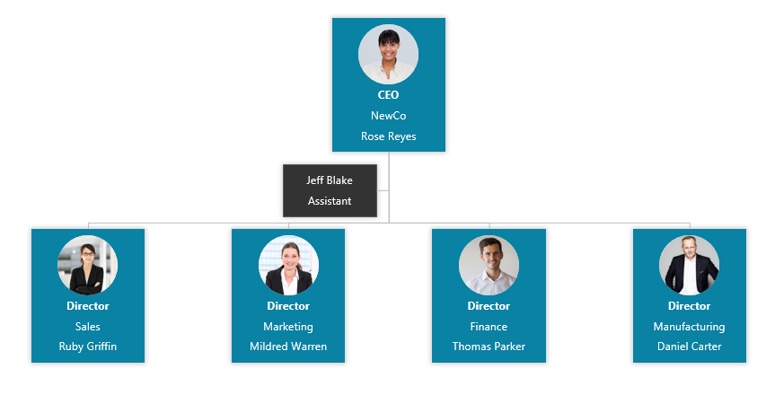
  • Instead, decide right from the beginning that you will split your org chart across multiple slides. The safest bet is to use 2 levels per slide (for instance, the CEO and the people who report directly to her on one slide). two level powerpoint org chart slide
  • It’s possible you can get 3 levels on one slide, but once you start building it that way, it is a real pain to go back and switch it to just 2 levels per slide.three level powerpoint org chart slide

Make a good title for each slide

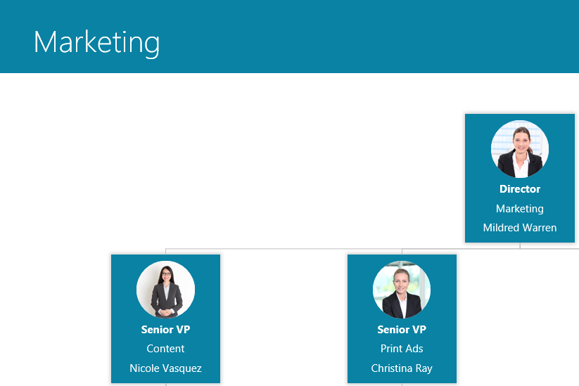
  • PowerPoint slides usually have a helpful title at the top to give the reader a quick overview of what they’re looking at. If you have a “task focused structure”, then it’s great to have the unit name at the top (like Sales, or Finance, or Midwest Customer Support).  If you have a culture where people are more important than tasks, then go ahead and make the slide title the name of the person at the top (John Rex, Samantha King, or Mary Charlemagne) powerpoint org chart slide title

Choose what info you want in each org chart box

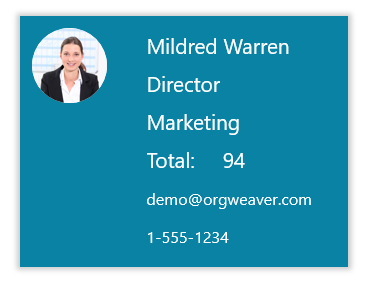
  • More boxes per slide = Less info per box org chart example detailed text
  • What you put into each org chart box has a huge impact on how many boxes you can fit on each slide. If you want Name, Title, Unit, Email, Responsibilities, Shoe Size, AND a Profile Photo, then you have to have a very small org structure. That is why most org charts you see are limited to just Name and Title.org chart box example limited text
  • When choosing what to add, be aware of your organization’s culture and the limitations of PowerPoint

Use SmartArt in PowerPoint to automatically connect boxes with lines

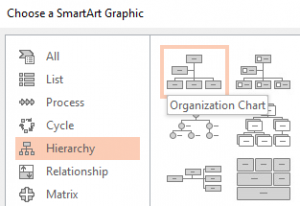
Ok, decisions are made. Now you are ready to actually build the org chart. Some might recommend that you draw each box and each connector line in your org chart, but that can be frustrating. I recommend using SmartArt so you can build your org chart a little quicker. SmartArt org chart


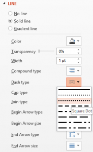
You can change solid-lines to dotted-lines by selecting the line, right-clicking, selecting Format Shape, selecting Line, and then changing the option for Dash Type.

dotted line org chart

Alternatives to PowerPoint org charts

PowerPoint is just one example of a tool that lets you draw boxes to create an org chart. Other drawing tools include LucidChart, Gliffy, Canva, and Prezi. If the limitations of drawing and updating each org chart box manually are too great for you, then luckily you have some alternative options. Here are the key differences between a drawing tool like PowerPoint and an org chart software:

  • Create an org chart from Excel data
  • Batch edit all org chart box layouts at once
  • Drag and drop to make changes in hierarchy
  • Collaborate online
  • Export to PowerPoint slides automatically
  • Publish dynamic & searchable org charts online

OrgWeaver meets all of those requirements for an org chart software and has a free version to get started. There are other tools as well that don’t meet all of those requirements, but are worth comparing and contrasting (such as OrgPlus, Organimi, and Pingboard).

OrgWeaver org chart software


How the Oakland A’s get more from their organizational structure

Billy Beane is the legendary Executive Vice President of Baseball Operations for the Oakland Athletics. It’s not often one gets played by Brad Pitt in a major motion picture because one takes a “data first” approach to management (Moneyball).  We are strong believers in “data first” here at OrgWeaver when it comes to organizational structures, so we were naturally pleased to be able to help out the Oakland A’s.OrgWeaver org chart software used by Oakland A's

When the senior leadership of the Oakland A’s wanted to make some organizational structure changes, they searched the web to find the best org chart software. Here’s what they needed:

  • Beautiful org chart design (with their team colors)
  • Profile pictures
  • Easy navigation
  • Drag and drop editing
  • Collaboration and sharing
  • Structured data

It was quickly obvious that the typical option for org charts (PowerPoint) wouldn’t meet their needs.

Why PowerPoint is bad for org charts

PowerPoint is great for many things, but not for org charts. It is limited because it is essentially a drawing software. Each org chart box needs to be created one by one. And many times if you want to make a simple change to one org chart box, you have to rearrange all of the other org chart boxes. This makes it too time consuming to explore different organizational structure options. For those of you have have tried to design a complex org structure in PowerPoint, you understand why it always ends up as a dead document that goes unused (because no one wants to spend the time to update it).

Why the Oakland A’s chose OrgWeaver

The short answer is that OrgWeaver is specifically built to handle org charts and is the best org chart software available online. For the long answer, here’s a quote directly from the A’s:

“We needed a dynamic org chart that looks great and is easy to drag and drop. Our goal was to have our senior leadership spec out a new org structure and then share it with the entire team. OrgWeaver has been invaluable in that process. Compared to PowerPoint and a few other options we tried, OrgWeaver is easy to use and does a lot of the hard work for you. I’d definitely recommend it to others who need an org chart software.”

-Dash Davidson, Strategic Assistant to the President, Oakland Athletics

Why org charts matter

The Oakland A’s are not alone in their need to make better org charts. Other sports teams, businesses, and governmental agencies also need to align changes with senior leadership before communicating a new org structure in a way that everyone understands. Org charts matter because they are like a map of how teams work together. Without them, the only way to navigate through an organization is if one personally knows every colleague and their daily tasks.

So, steal a strategy from the Oakland A’s playbook and try OrgWeaver if you agree that org charts matter.

Compare Org Chart Alternatives in 2017

org chart software with custom colorsIt can be confusing to compare org chart software. There are tools to draw org charts by hand. There are tools to build org charts automatically from data. There are even tools that should never be used to make an org chart, but are still popular (watch out for Visio).

Here at OrgWeaver, we make modern online org chart software. We spend a lot of time figuring out what works and what doesn’t for org chart users. Instead of keeping that analysis to ourselves, we thought it’d be helpful to share. Here’s our main points for how to compare org chart software alternatives.

Quick summary

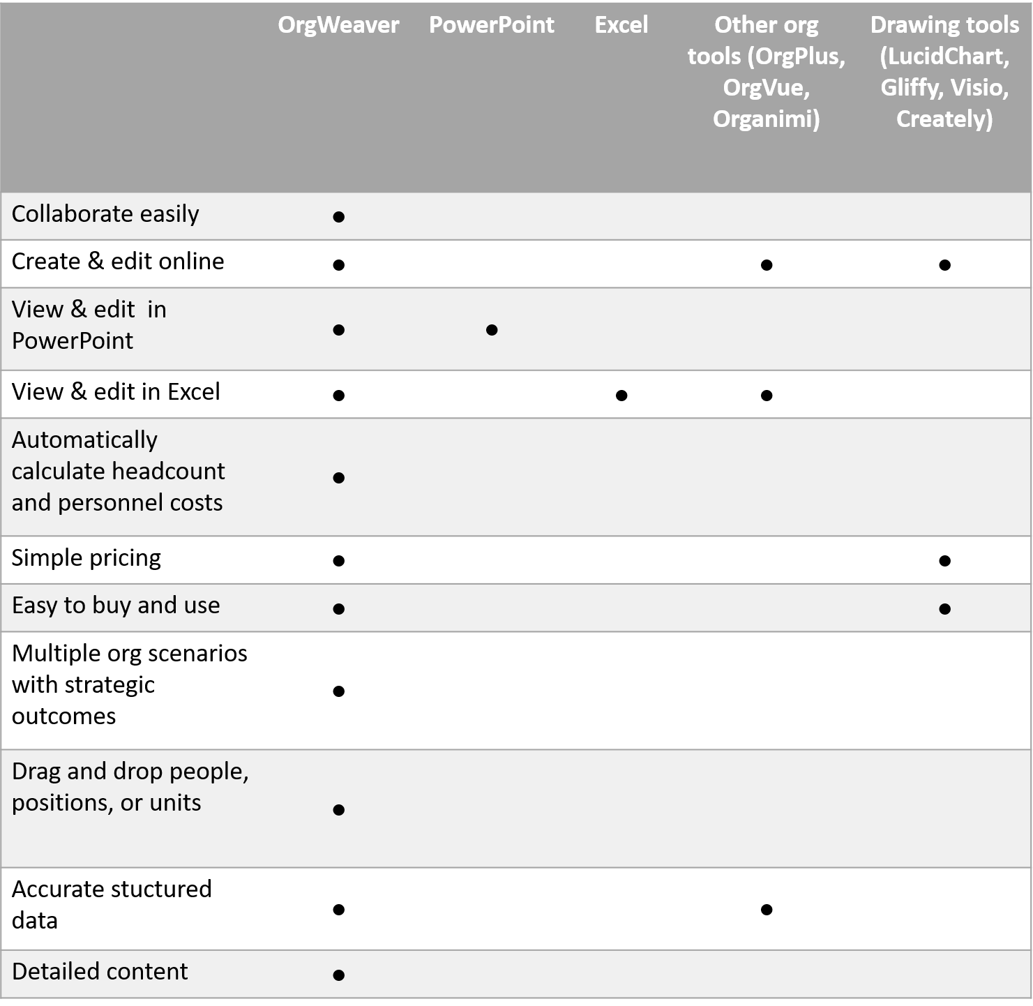
An org chart software should have simple affordable pricing (like LucidChart or Gliffy), automatically create org charts from data (like OrgPlus or Organimi), and still integrate fully with PowerPoint and Excel. We built OrgWeaver to fit into that sweet spot, but the proof can be seen first hand in our free org chart subscription plan.

Collaborate easily

What’s the point of having an org chart if you can’t collaborate in real-time around it? This is often a frustrating part of finding an org chart software. In fact, many people give up and just get 10 people in a room drawing on a whiteboard.

Benefits:

  • Communicate clearly
  • Make decisions faster

Create & edit online

Desktop software is very limiting. That’s why the whole world seems to be moving to online tools that work in any web browser on any device. There is no “Facebook for your Desktop” for a reason. And org chart software should be no different.

Benefits

  • Work anywhere
  • Keep your data safe

View & edit in PowerPoint

PowerPoint is a fact of life. If you’re going to present your org chart, you’re going to want to do with the most ubiquitous presentation software. Even though you want to keep your org chart online, it’s nice to export and make small tweaks in PowerPoint so that you’re presentation is designed perfectly.

Benefits:

  • Flexibility
  • Ease of use

Automatically calculate headcount and personnel costs

An org chart is so much more than boxes. It can show how your organization truly works today. It can be a strategic necessity when designing an organization for the future. Everyone wants to know how many people work in which departments, so it’s important that your org chart software automatically calculates that out of the box.

Benefits:

  • Better understanding of today
  • Plan for the future

Simple pricing

If an org chart vendor doesn’t publish their prices, beware of their business model. It’s possible they are trying to sell “nice-to-have” features for astronomical prices that you never actually use. If you can understand a vendor’s pricing without talking to a sales person, that’s typically a good sign that they are focused on adding value at a competitive price.

Benefits

  • Use what you pay for
  • Budget accurately

Easy to buy and use

If you need an org chart today, you don’t have time to go through a purchasing process. If you can get started for free, upgrade in the org chart software with a credit card, and train yourself with in-app tutorials, you can save a huge amount of time and costs in the purchasing process.

Benefits

  • Try before you buy
  • Train yourself

Multiple org scenarios with strategic outcomes

An organization isn’t just one org structure. It’s last years’ org structure and next years’ org structure. There are different scenarios to consider, and stages to an implementation of a new org structure. Great org chart software solutions allow you to visualize all the scenarios and their strategic impact.

Benefits

  • Clone existing org charts to plan for future structures
  • Get everyone on board with org changes

Drag and drop people, positions, or units

Org charts are easily understood when one box represents one person’s role. So that’s how they usually get created. But behind that simplicity there are more complex decisions. What if you want to move an org unit of 30 people to another org unit? Wouldn’t it be great to just drag and drop them all at once? Or what if you want to just move a person, but leave their current position empty? It’s important to find a software that allows you to just drag and drop exactly what you want.

Benefits

  • Control
  • Quick changes

Accurate structured data

When making a comparison of org chart alternatives, it can be easy to focus only on looks. But behind every org chart box is data that needs to be structured. For instance, if you draw an org chart, none of the data is structured. It can’t be analyzed or updated automatically.

Benefits:

  • Update automatically
  • Better analysis

Detailed content

The bigger the org chart, the less information it shows. That’s why it’s important to find an org chart software that has smart ways to show detailed content even on big org charts. For instance, if you want to show a photo, name, position, headcount, location, email address, phone number, personal bio, and position description on one org chart box, you better be able to design the box well.

Benefits:

  • Explore deep content
  • Search for keywords in descriptions

Org Chart Alternatives Comparison


Compare org chart software alternatives

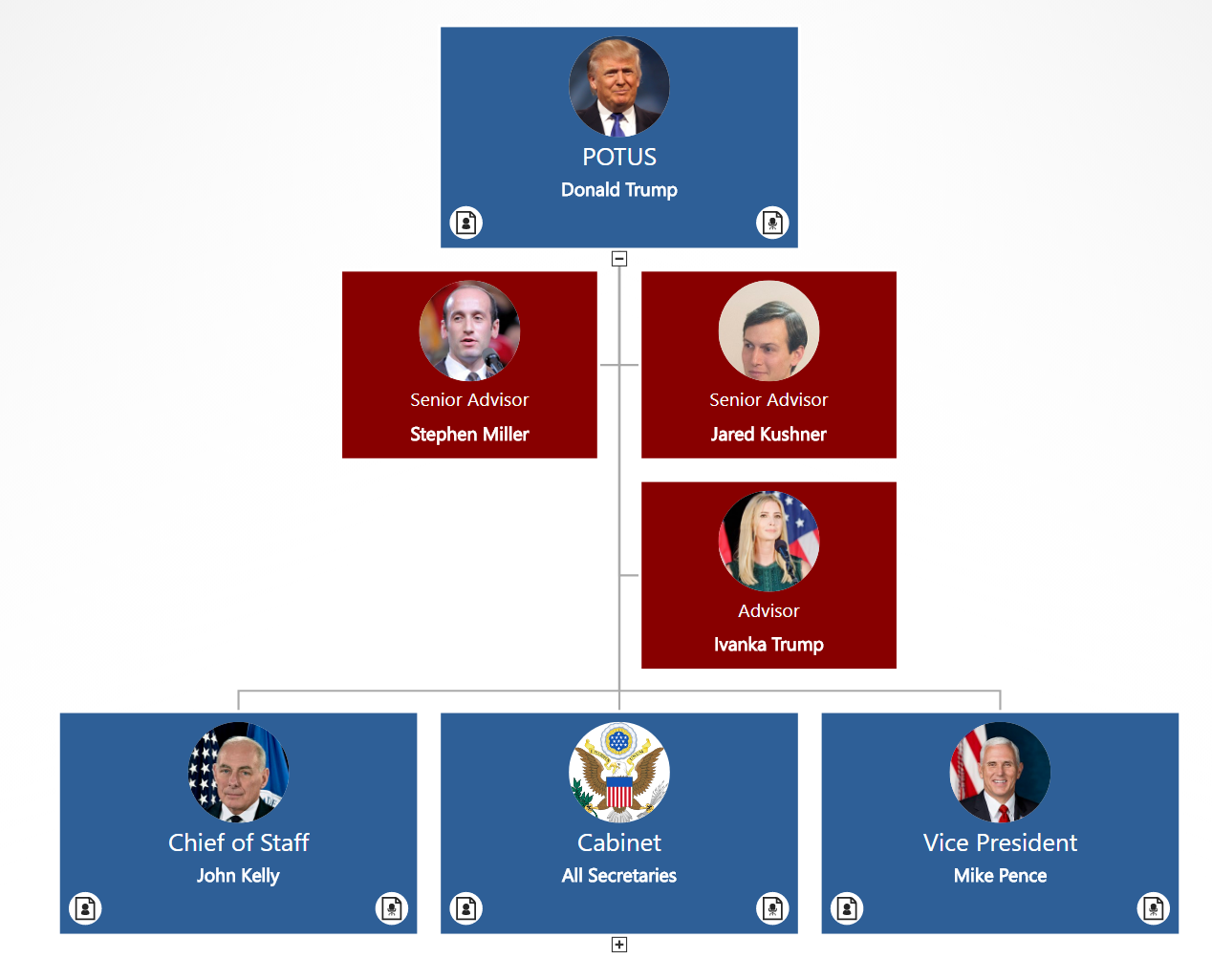
President Donald Trump’s Administration in an Org chart

Here at OrgWeaver, we’re keeping track of President Trump’s org chart. By clicking below, you’ll find an interactive online org chart of the key positions surrounding President Trump. Included are bios and position descriptions for cabinet members taken from Wikipedia. [Last updated November 14, 2017]

Click to view interactive version of Trump’s org chart

president trump org chart


MIT Organization Chart Review

We love org charts because of the stories they tell. They’re essential for transparency and understanding (both for people within an organization and for outsiders).

If you do a Google search for “Organizational Chart”, the results tell a clear story about who cares about org charts. First, there are some articles and software programs to help you make org charts. But on the second page of results, there are published org charts primarily from government agencies and universities. These are the people who seem to care the most about the transparency that published org charts provide.

To shine a light on the importance of org charts for small & medium businesses, governments, universities, and enterprises, we decided to review some of these published org charts. First up is MIT.

FINDING MIT’S ORG CHART

Of all of the org charts on the second page of Google results, MIT’s org chart is the most interesting. First of all, it exists on it’s own subdomain at http://orgchart.mit.edu/. That shows that they’ve made their org chart a top priority. Secondly, they also allow the org chart to be downloaded and printed in PDF. As much as people love to view an org chart online, there is something safe about downloading the org chart as well. Kudos to MIT for providing both options.

What’s good:

  • Easy to find the main org chart
  • Two viewing options (online and PDF)

What’s bad:

  • There are different org charts for senior leadership & corporation officers. Very difficult to find lower levels of the organization structure.

ORG CHART NAVIGATION AT MIT

Navigating MIT’s org chart online is straight forward. All boxes are visible on one page. To get more detailed info, job titles are used as links to a bio page with contact information and a description.

What’s good:

  • Quickly view reporting relationships
  • Profile pictures

What’s bad:

  • Limited to only 3 levels
  • No expand/collapse view
  • No pan and zoom

UPDATING MIT’S ORG CHART

MIT makes a note about the last time that the org chart was updated. As of this review, the latest update was September 20, 2016. MIT seems to be using Drupal as a Content Management System, so it should be fairly straight forward to make changes for the administrator.

What’s good:

  • When it was last updated

What’s bad:

  • No drag-and-drop option to update

MIT’S OFFICIAL ORG CHART VS. MIT’S ORGWEAVER ORG CHART

Modern online org charts can do a lot to increase transparency and understanding. Below is an example of MIT’s official org chart as well as a dynamic drag-and-drop org chart created with OrgWeaver. Click the links to both to compare. Let us know which one you prefer by heading over to our Facebook Page.

MIT Official Org Chart top.png

Click to view MIT’s official org chart


MIT OrgWeaver Org Chart.png

Click to view MIT’s OrgWeaver org chart

3 Essential Ways to Get the Most From Your Organization Chart

Organization charts are essential for many businesses. Next time you’re thinking of upgrading to a modern org chart software, remember these essential things:

1. Search your org chart quickly

Can you imagine trying to read an organization chart that includes hundreds or thousands of employees? It’s an impossible task. That’s why being able to quickly search all of the data in your org chart is such an essential time-saver.

  • Search for anyone who holds the position “Director” (even if you spell it wrong)
  • Search for people named “John”
  • Search for the “Finance” unit

Search_within_an_organization_chart.gif

2. Keep your official style and colors consistent in published org charts

Org charts are a great way to communicate with your team, vendors, shareholders, and others. Just like the effort you put into making beautiful marketing material, effort is required to make sure your org charts consistently communicate your brand.

Org charts typically get published as PowerPoint or PDF files. Make sure you can control these key things when you publish:

  • Size, shape, color, shadow, and outline of every org chart box
  • Header, footer, and background styles
  • Fonts, text size, and employee photo placement

Use_any_PowerPoint_template_640.gif

3. Automatically update your org chart

After you get everything correct in your organization chart, it’s best not to have to start from scratch each time changes need to be made. Modern org charts should be easy enough to update quickly and often.

Org chart software that can do these things can save you a lot of time.

  • Update org chart data based on an Excel spreadsheet
  • Drag-and-drop org chart boxes for quick changes in meetings
  • Export org chart data so it can be used in other systems

OrgWeaver has you covered

A new version of OrgWeaver was released today that covers these 3 essential ways to get the most out of your org chart. Want to test if OrgWeaver can help you save time and money? It’s easy and free to sign up for an OrgWeaver account.