Org chart design: Choose a layout that your team will love
With the right org chart software, you can make the best org chart design. The design of your org chart matters; it’s how your team, new recruits, partners, suppliers, and stakeholders understand who is in charge of what.
If you’re starting with a blank screen in front of you, and don’t know where to start with your org chart design, here are some tips on how to clarify what is most important for your unique team.
Choosing an org chart design
Org charts are made up of boxes that are organized by levels. It sounds simple, but can quickly get complicated if you’re not clear about a few things:
- Should all org chart boxes include the same information?
- If yes, then it’s simple to start adding names and titles to your boxes
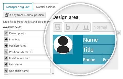
- If no, then what boxes need to be different? Should manager boxes have more information (such as headcount, department name, location, phone number, etc.)? Should regular employee boxes be smaller with less information?
- Tip: Make sure you can edit all boxes at once so you don’t waste time going back and changing hundreds of boxes by hand.
- Should levels be comparable? For instance, should a “Sr. Manager” in the Sales department be able to visually see that she is on the same level as a “Sr. Manager” in the Finance department?
- If yes, then be strict with how you place boxes in your org chart.
- If no, then you can place boxes wherever they fit best on the screen.
- What colors do you want your org chart boxes to be?
- Often, a neutral color is easy to read.
- However, it can be much more personal to use your brand’s official colors.
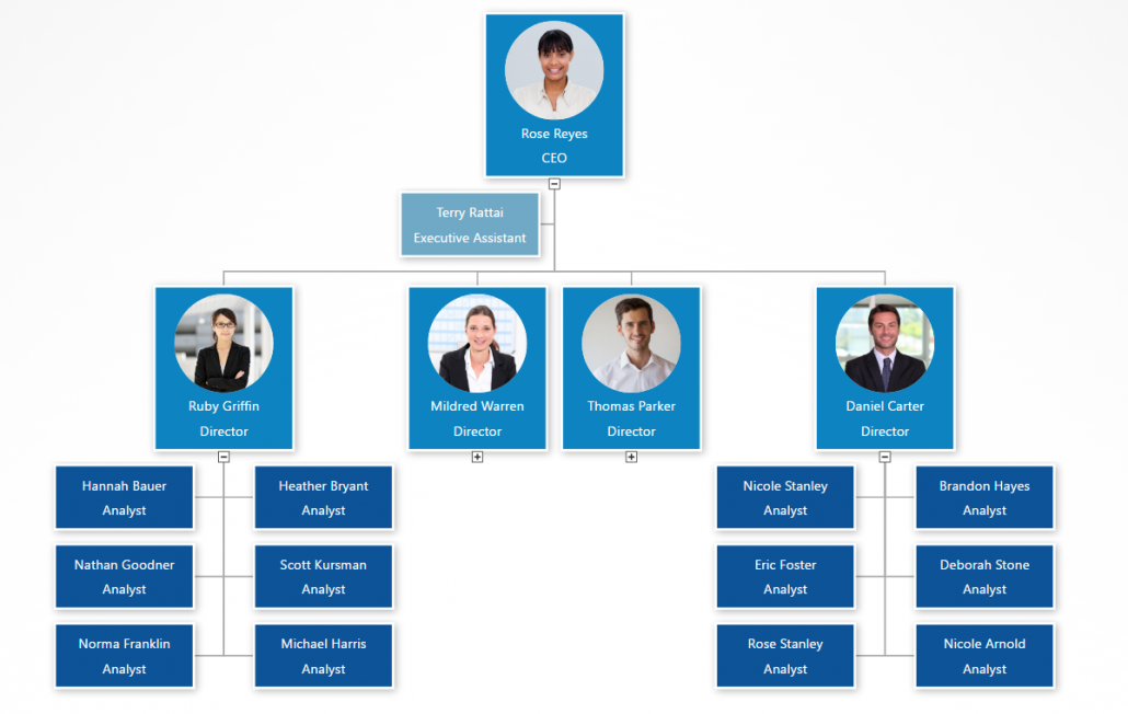
Org chart software design: Simple white example
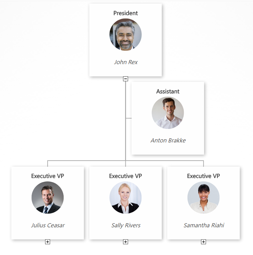
This org chart design example has a very simple black text layout on white boxes. It’s easy to see that of the 4 people that report to the CEO, three of them are on level 2, and one of them is an assistant without a level. Every box includes the same basic info about job title and employee name. An org chart like this is very easy to glance at and understand.
Org chart software design: Simple gray example
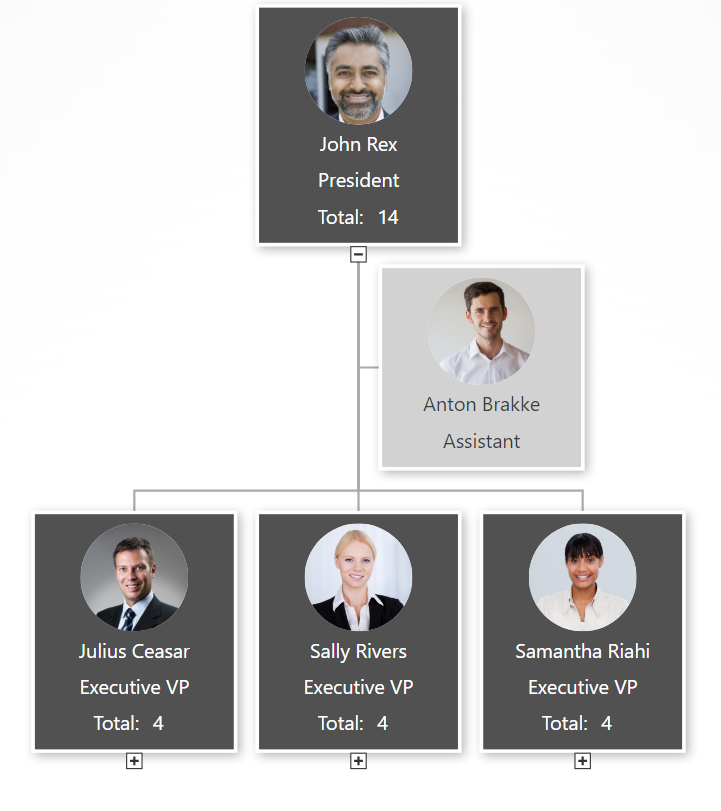
In this example of an org chart, some different design choices were taken. For example, manager boxes include some extra information about total headcount (automatically calculated by the OrgWeaver org chart software). Also, there is a different color for managers (dark gray) and assistants (light gray) to more strongly differentiate between levels within the org chart.
Org chart software design: Detailed black example
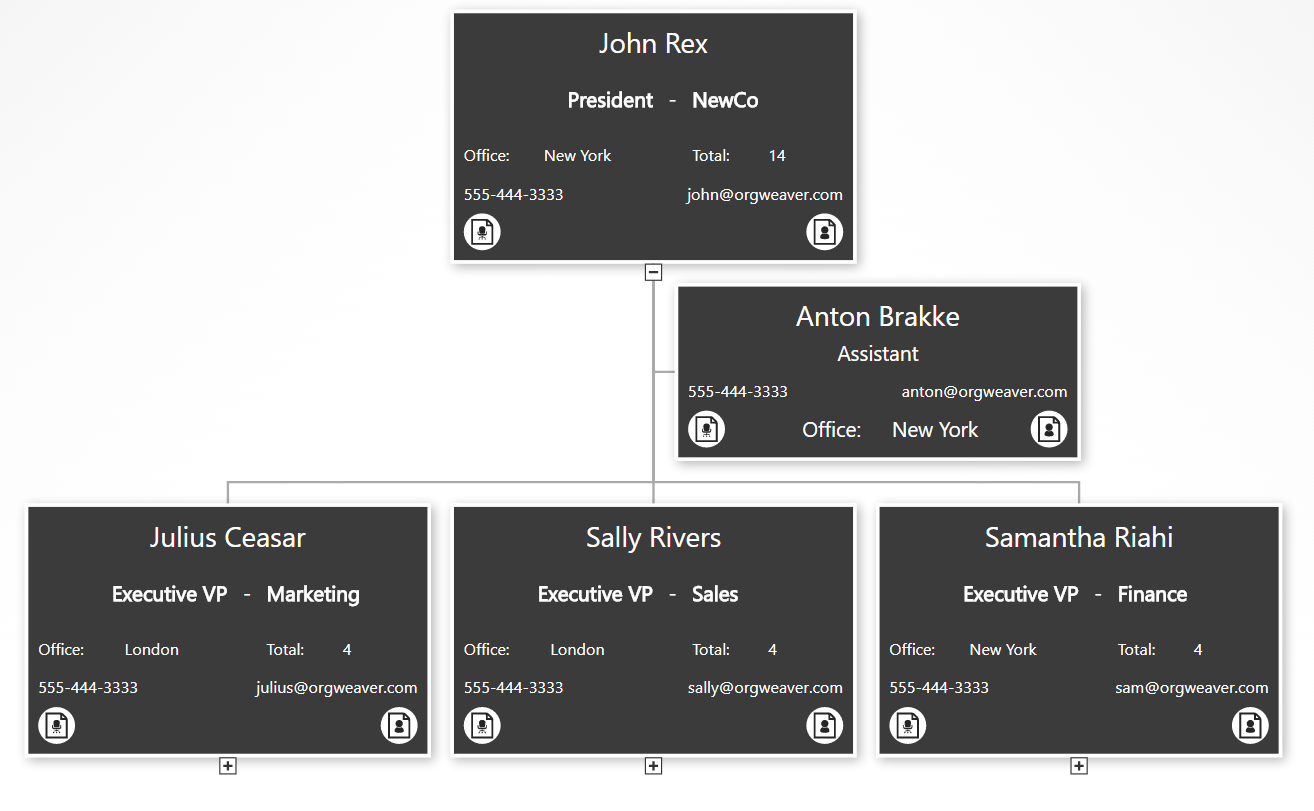
This org chart example gives much more detailed information. As you can see, the core info about the employee and the job title are still there, but we’ve added data about a department/unit, office location, phone email, job description, and employee bio. To make room for it all, we’ve removed the employee photo. Also, we’ve made all of the boxes the same color, but show less info for people that are not managers (see the “Anton Brakke” box).
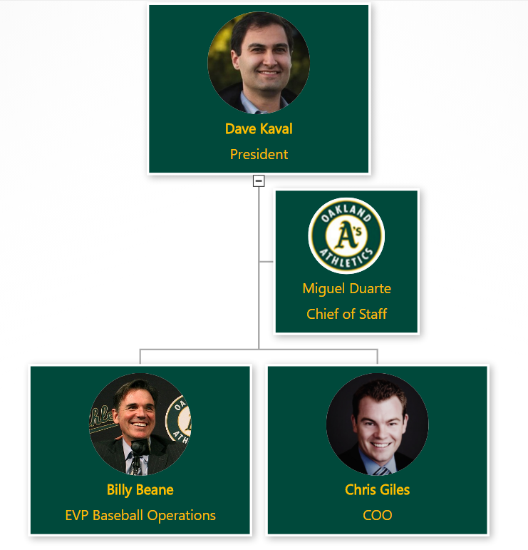
Org chart software design: Basic branded example
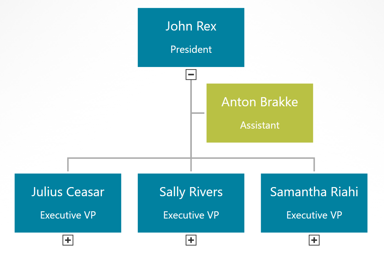
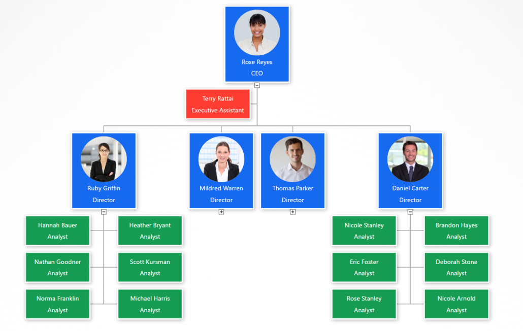
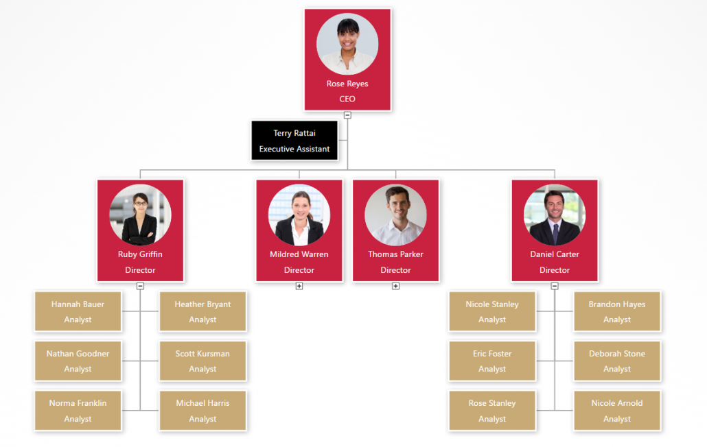
This final example built with online org chart software strips away everything to the basics, but uses branded colors instead of neutral colors. This type of org chart can give your team the feeling that it was truly designed for them.


 he HR professionals we’ve worked with are heroes, not just firefighters. They see themselves at the center of the most important strategic, financial, and technological changes that their companies face. Instead of deferring to strategy consultants, finance teams, and IT leaders, they are taking their place at the table. When Executive Committees ask “Are we on track with our strategy?” or “Will we complete this critical project on time?”, HR Teams who embrace the power of the latest software innovations are the ones who have the most complete answers at their fingertips. That’s what makes them workplace heroes; being the ones that people turn to for the most critical questions.